Benvenuto nelle Font Più Popolari — dove popolarità e qualità si incontrano. Qui trovi i font più scaricati e usati dell'anno. Se cerchi scelte sicure per logo, web o social, inizia da qui.
Ogni font top si distingue per equilibrio, leggibilità e versatilità. Troverai sans serif moderne, script eleganti, serif vintage e display minimalisti.
-
 Scaricare 415 Downloads@WebFont
 -
![Goodlights font caratteri gratis]() Scaricare 415 Downloads@WebFont
Scaricare 415 Downloads@WebFont -
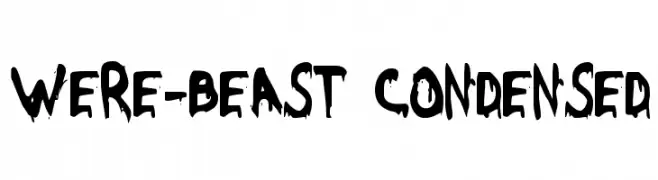
( Fonts by Daniel Zadorozny - www.iconian.com )
A bold, dripping font with a horror-inspired, eerie aesthetic.
![Were-Beast Condensed font caratteri gratis]() Scaricare 415 Downloads@WebFont
Scaricare 415 Downloads@WebFont -
( Fonts by Darcy Baldwin - darcybaldwin.com. Free for personal use only )
A playful, handwritten-style font with rounded, casual characters.
![DJB Geeks Who Wear Glasses font caratteri gratis]() Scaricare 415 Downloads@WebFont
Scaricare 415 Downloads@WebFont -
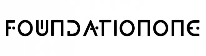
( Fonts by rsperberg - glyphery.com - Personal-use only. For commercial use please contact owner. )
A modern, geometric font with unique circular elements and a futuristic style.
![FoundationOne font caratteri gratis]() Scaricare 415 Downloads@WebFont
Scaricare 415 Downloads@WebFont -
-
![Equestrian by Darrian font caratteri gratis]() Scaricare 415 Downloads@WebFont
Scaricare 415 Downloads@WebFont -
![Poma font caratteri gratis]() Scaricare 415 Downloads@WebFont
Scaricare 415 Downloads@WebFont -
( Fonts by Tokokoo Studio )
A bold, rounded font with a playful and inviting style.
![Cocola font caratteri gratis]() Scaricare 415 Downloads@WebFont
Scaricare 415 Downloads@WebFont -
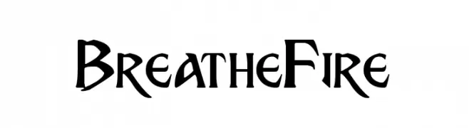
( Fonts by www.chequered.ink - Chequered Ink - Personal-use only. For commercial use please contact owner. )
A bold, dynamic font with sharp, angular edges and a fierce, energetic style.
![Breathe Fire font caratteri gratis]() Scaricare 415 Downloads@WebFont
Scaricare 415 Downloads@WebFont -
( Fonts by Vanessa Bays - bythebutterfly.com )
A tall, narrow, and modern font with elongated, thin characters.
![MySkinnyJeans font caratteri gratis]() Scaricare 415 Downloads@WebFont
Scaricare 415 Downloads@WebFont -
( Fonts by www.peter-wiegel.de. Personal-use only. For commercial use please contact owner. )
A playful, bubble-like decorative font with interconnected circular elements.
![Vrångö font caratteri gratis]() Scaricare 415 Downloads@WebFont
Scaricare 415 Downloads@WebFont -
( Fonts by shark_of_the_tale )
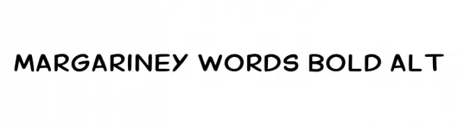
A playful, bold, and rounded font with a hand-drawn feel.
![Margariney Words Bold Alt font caratteri gratis]() Scaricare 415 Downloads@WebFont
Scaricare 415 Downloads@WebFont -
( Fonts by dustBUST - Andreas Nylin )
A futuristic, italicized font with rounded edges and a sci-fi aesthetic.
![Sci Fied Italic font caratteri gratis]() Scaricare 415 Downloads@WebFont
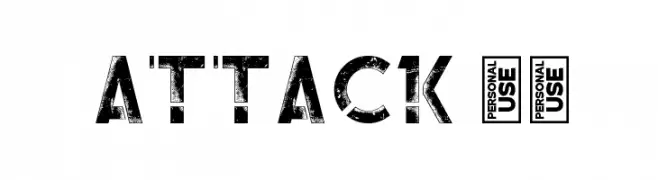
Scaricare 415 Downloads@WebFont -
![Attack 13 font caratteri gratis]() Scaricare 415 Downloads@WebFont
Scaricare 415 Downloads@WebFont -
![Nasa21 font caratteri gratis]() Scaricare 415 Downloads@WebFont
Scaricare 415 Downloads@WebFont -
( Fonts by www.dcoxy.com )
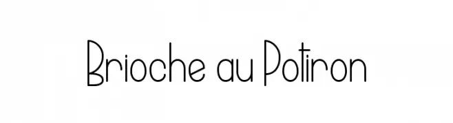
A playful, narrow font with consistent stroke width and a whimsical style.
![Brioche au Potiron font caratteri gratis]() Scaricare 415 Downloads@WebFont
Scaricare 415 Downloads@WebFont -
( Fonts by ShyFonts )
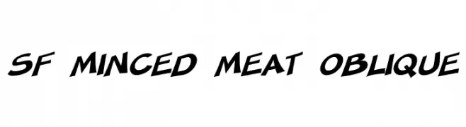
A bold, oblique font with a modern and energetic style.
![SF Minced Meat Oblique font caratteri gratis]() Scaricare 415 Downloads@WebFont
Scaricare 415 Downloads@WebFont -
( Fonts by Manfred Klein. Free for private and charity use. Free for commercial with donation to organizations )
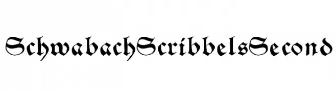
A bold, ornate blackletter font with sharp serifs and medieval flair.
![SchwabachScribbelsSecond font caratteri gratis]() Scaricare 415 Downloads@WebFont
Scaricare 415 Downloads@WebFont -
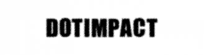
![DOTIMPACT font caratteri gratis]() Scaricare 415 Downloads@WebFont
Scaricare 415 Downloads@WebFont -
( Fonts by www.peter-wiegel.de. Personal-use only. For commercial use please contact owner. )
A serif font with a blend of classic elegance and modern playfulness.
![Berolina font caratteri gratis]() Scaricare 415 Downloads@WebFont
Scaricare 415 Downloads@WebFont -
![Night Wind Sent Sample font caratteri gratis]() Scaricare 415 Downloads@WebFont
Scaricare 415 Downloads@WebFont -
( Fonts by www.monofonts.com. Personal-use only. For commercial use please contact owner. )
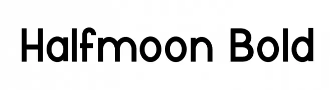
A bold, modern sans-serif font with clean, geometric lines.
![Halfmoon Bold font caratteri gratis]() Scaricare 415 Downloads@WebFont
Scaricare 415 Downloads@WebFont -
( گالری فانت فارسی پژوهش آريانا - only compatible with Farsi and Arabic )
A bold, dynamic font with thick strokes and a modern slant.
![Karim Bold font caratteri gratis]() Scaricare 415 Downloads@WebFont
Scaricare 415 Downloads@WebFont -
( Fonts by Daniel Zadorozny - www.iconian.com - Free for personal use )
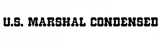
A bold, condensed font with a Western vintage style and decorative cut-out shapes.
![U.S. Marshal Condensed font caratteri gratis]() Scaricare 415 Downloads@WebFont
Scaricare 415 Downloads@WebFont -
![Gomo font caratteri gratis]() Scaricare 415 Downloads@WebFont
Scaricare 415 Downloads@WebFont -
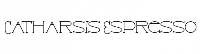
![Catharsis Espresso font caratteri gratis]() Scaricare 415 Downloads@WebFont
Scaricare 415 Downloads@WebFont -
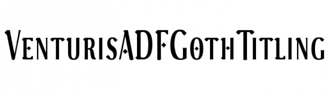
( Fonts by Arkandis Digital Foundry )
A bold, decorative serif font with Gothic influences and high contrast strokes.
![VenturisADFGothTitling font caratteri gratis]() Scaricare 415 Downloads@WebFont
Scaricare 415 Downloads@WebFont -
Caratteri di joorgemoron. For commercial use please contact the owner.
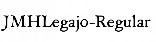
( Free for personal use. )
A classic, handwritten-style font with an elegant and historical touch.
![JMHLegajo-Regular font caratteri gratis]() Scaricare 415 Downloads@WebFont
Scaricare 415 Downloads@WebFont -
( Fonts by or from www.graffitifonts.net )
A playful, handwritten font with dynamic and irregular letterforms.
![Kabanoss Normal font caratteri gratis]() Scaricare 415 Downloads@WebFont
Scaricare 415 Downloads@WebFont -
( Free for a personal use. For a commercial use please visit www.kevinandamanda.com )
A bold, playful handwritten font with chunky, uneven strokes.
![Pea Lacy Chunky font caratteri gratis]() Scaricare 415 Downloads@WebFont
Scaricare 415 Downloads@WebFont -
( Fonts by Style-7 - www.styleseven.com - Personal-use only. For commercial use please contact owner. )
A bold, geometric font with rounded edges and a modern, futuristic style.
![Rounded Line 7 font caratteri gratis]() Scaricare 415 Downloads@WebFont
Scaricare 415 Downloads@WebFont -
( Fonts by www.dcoxy.com )
A bold, italicized font with a dynamic and energetic style.
![Daily Quantum font caratteri gratis]() Scaricare 414 Downloads@WebFont
Scaricare 414 Downloads@WebFont -
( Fonts by Billy Argel - www.billyargel.com - Personal-use only. For commercial use please contact owner. )
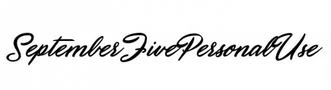
A dynamic and flowing script font with elegant, cursive letterforms.
![September Five Personal Use font caratteri gratis]() Scaricare 414 Downloads@WebFont
Scaricare 414 Downloads@WebFont -
( Sholeha Anata )
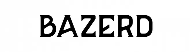
A bold, geometric font with a modern and edgy style.
![BAZERD font caratteri gratis]() Scaricare 414 Downloads@WebFont
Scaricare 414 Downloads@WebFont -
( Fonts by a www.fontfabric.com. Personal-use only. For commercial use please contact owner. )
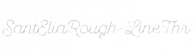
A cursive, hand-drawn font with a rough, artistic style.
![SantEliaRough-LineThr font caratteri gratis]() Scaricare 414 Downloads@WebFont
Scaricare 414 Downloads@WebFont


Quali sono i font più popolari adesso?
Poppins, Roboto, Montserrat, Open Sans e Lato sono molto usati per le forme pulite e l'ampia applicabilità — dall'identità di marca alle landing page e ai poster.
Quali font si usano spesso nei loghi?
Le sans serif geometriche (es. Poppins, famiglie in stile Gotham) sono scelte comuni per un branding pulito e scalabile. Per un tocco personale restano valide script e stili manoscritti. Abbina un display deciso per i titoli a un corpo testo neutro per riconoscibilità ed equilibrio.
Ogni quanto si aggiorna la lista?
Con regolarità, in base ai download e all'attività reale. Torna spesso per scoprire in anticipo le nuove preferite.
💡 Consiglio: aggiungi ai preferiti — le tendenze cambiano in fretta e i font top di oggi possono ispirare il rebranding di domani.