Benvenuto nelle Font Più Popolari — dove popolarità e qualità si incontrano. Qui trovi i font più scaricati e usati dell'anno. Se cerchi scelte sicure per logo, web o social, inizia da qui.
Ogni font top si distingue per equilibrio, leggibilità e versatilità. Troverai sans serif moderne, script eleganti, serif vintage e display minimalisti.
-
 Scaricare 414 Downloads@WebFont
 -
( Fonts by Dan P. Lyons - Personal-use only. For commercial use please contact owner. )
A bold, geometric font with clean lines and a modern, approachable style.
![dvcc font caratteri gratis]() Scaricare 414 Downloads@WebFont
Scaricare 414 Downloads@WebFont -
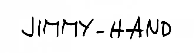
![JIMMY-HAND font caratteri gratis]() Scaricare 414 Downloads@WebFont
Scaricare 414 Downloads@WebFont -
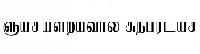
![Saraswathy Regular font caratteri gratis]() Scaricare 414 Downloads@WebFont
Scaricare 414 Downloads@WebFont -
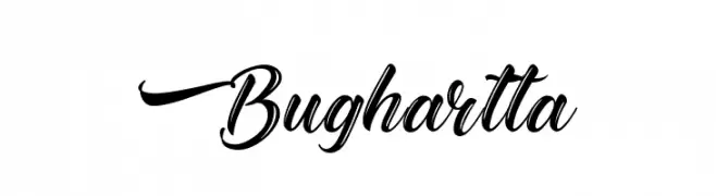
( Fonts by Kotak Kuning Studio - kotakkuning.com - Personal-use only. For commercial use please contact owner. )
An elegant, flowing script font with ornate uppercase and smooth lowercase letters.
![Bughartta font caratteri gratis]() Scaricare 414 Downloads@WebFont
Scaricare 414 Downloads@WebFont -
-
![Fun Euro Original Condensed No. 1 [Demo] font caratteri gratis]() Scaricare 414 Downloads@WebFont
Scaricare 414 Downloads@WebFont -
( Fonts by www.peter-wiegel.de. Personal-use only. For commercial use please contact owner. )
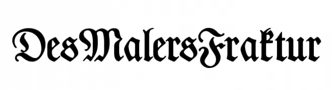
A traditional Blackletter font with ornate, medieval-inspired design.
![DesMalersFraktur font caratteri gratis]() Scaricare 414 Downloads@WebFont
Scaricare 414 Downloads@WebFont -
( Kitch22 - Niall Kitching - www.kitch22.co.uk )
Bold, elongated slab serif font with high contrast and tight spacing.
![Poster Slab Caps font caratteri gratis]() Scaricare 414 Downloads@WebFont
Scaricare 414 Downloads@WebFont -
( Fonts by Luke Owens - Personal-use only. For commercial use please contact owner. )
A modern, oblique font with extended width and medium contrast, ideal for dynamic designs.
![Waukegan LDO Extended Oblique font caratteri gratis]() Scaricare 414 Downloads@WebFont
Scaricare 414 Downloads@WebFont -
( Fonts by Ariel MartÃn Pérez - Personal-use only. For commercial use please contact owner. )
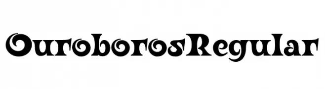
A bold, decorative font with high contrast and unique character designs.
![Ouroboros Regular font caratteri gratis]() Scaricare 413 Downloads@WebFont
Scaricare 413 Downloads@WebFont -
( Fonts by Woodcutter Manero - http://www.woodcutter.es - Personal-use only. For commercial use please contact owner. )
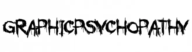
A chaotic, edgy font with jagged, rough edges and irregular strokes.
![GRAPHIC PSYCHOPATHY font caratteri gratis]() Scaricare 413 Downloads@WebFont
Scaricare 413 Downloads@WebFont -
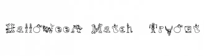
![Halloween Match Tryout font caratteri gratis]() Scaricare 413 Downloads@WebFont
Scaricare 413 Downloads@WebFont -
( Fonts by www.DigitalDreamDesign.net )
A bold, oblique font with a modern and dynamic style.
![D3 Cozmism Hiragana Oblique font caratteri gratis]() Scaricare 413 Downloads@WebFont
Scaricare 413 Downloads@WebFont -
![4K&A font caratteri gratis]() Scaricare 413 Downloads@WebFont
Scaricare 413 Downloads@WebFont -
( Fonts by Jonathan Harris - www.tattoowoo.com )
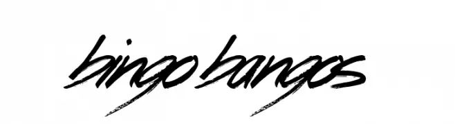
A bold, brush-stroke font with a dynamic and energetic style.
![Bingo Bangos font caratteri gratis]() Scaricare 413 Downloads@WebFont
Scaricare 413 Downloads@WebFont -
![Banana Split Regular font caratteri gratis]() Scaricare 413 Downloads@WebFont
Scaricare 413 Downloads@WebFont -
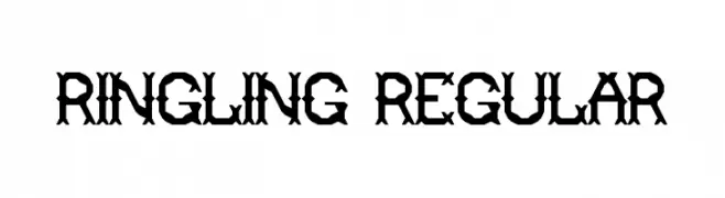
![Ringling Regular font caratteri gratis]() Scaricare 413 Downloads@WebFont
Scaricare 413 Downloads@WebFont -
![robotic font caratteri gratis]() Scaricare 413 Downloads@WebFont
Scaricare 413 Downloads@WebFont -
( Fonts by Nick Curtis - www.nicksfonts.com )
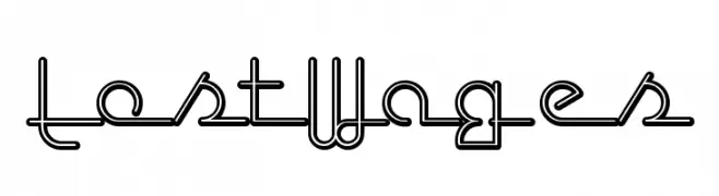
A modern, continuous line font with a geometric and futuristic style.
![LostWages font caratteri gratis]() Scaricare 413 Downloads
Scaricare 413 Downloads -
( Fonts by Font Bundles )
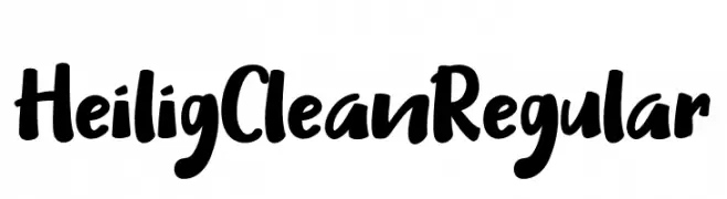
A bold, handwritten-style font with a playful and energetic appearance.
![Heilig Clean Regular font caratteri gratis]() Scaricare 413 Downloads@WebFont
Scaricare 413 Downloads@WebFont -
( Fonts by Jonathan Richard - jonathanr.net )
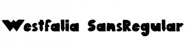
A bold, playful font with a hand-drawn, irregular style.
![Westfalia SansRegular font caratteri gratis]() Scaricare 413 Downloads@WebFont
Scaricare 413 Downloads@WebFont -
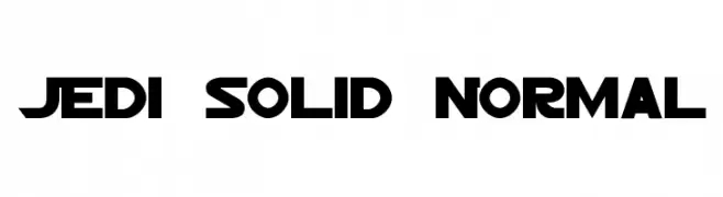
![Jedi Solid Normal font caratteri gratis]() Scaricare 413 Downloads
Scaricare 413 Downloads -
( Fonts by Khurasan )
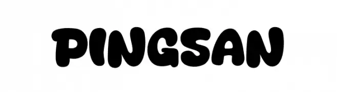
A playful, bold font with rounded, bubble-like characters.
![Pingsan font caratteri gratis]() Scaricare 413 Downloads@WebFont
Scaricare 413 Downloads@WebFont -
![Alien C&C3 font font caratteri gratis]() Scaricare 413 Downloads@WebFont
Scaricare 413 Downloads@WebFont -
( Fonts by www.typodermicfonts.com - Ray Larabie )
A vintage serif font with elegant, elongated letterforms and subtle serifs.
![EffloresceAntique-Regular font caratteri gratis]() Scaricare 413 Downloads@WebFont
Scaricare 413 Downloads@WebFont -
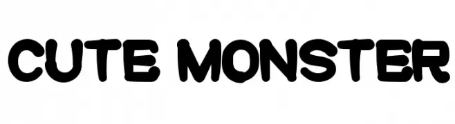
![cute monster font caratteri gratis]() Scaricare 413 Downloads@WebFont
Scaricare 413 Downloads@WebFont -
( Fonts by LetterStock )
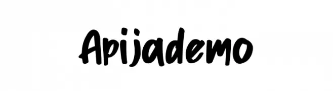
A bold, handwritten font with a playful and energetic style.
![Apijademo font caratteri gratis]() Scaricare 413 Downloads@WebFont
Scaricare 413 Downloads@WebFont -
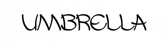
![UMBRELLA font caratteri gratis]() Scaricare 413 Downloads@WebFont
Scaricare 413 Downloads@WebFont -
( imagex - www.imagex-fonts.com )
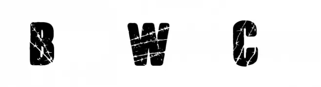
A bold, distressed font with a rugged, textured appearance.
![Barb Wire Club font caratteri gratis]() Scaricare 413 Downloads@WebFont
Scaricare 413 Downloads@WebFont -
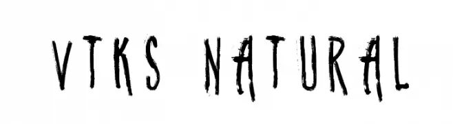
( Fonts by Douglas Vitkauskas - www.vtksdesign.com. Personal-use only. For commercial use please contact owner. )
A rugged, hand-drawn brush-style font with dynamic strokes and an organic feel.
![vtks natural font caratteri gratis]() Scaricare 413 Downloads@WebFont
Scaricare 413 Downloads@WebFont -
( Fonts by Nick Curtis - www.nicksfonts.com )
A tall, narrow font with elegant inline detailing and a modern style.
![Lagniappe-Inline font caratteri gratis]() Scaricare 413 Downloads@WebFont
Scaricare 413 Downloads@WebFont -
![Cosmical disfase Cosmical disfase font caratteri gratis]() Scaricare 413 Downloads@WebFont
Scaricare 413 Downloads@WebFont -
( Fonts by Dieter Steffmann )
A bold, three-dimensional serif font with a vintage yet modern appeal.
![PlastischePlakat-Antiqua font caratteri gratis]() Scaricare 413 Downloads@WebFont
Scaricare 413 Downloads@WebFont -
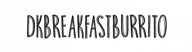
![DKBreakfastBurrito font caratteri gratis]() Scaricare 413 Downloads@WebFont
Scaricare 413 Downloads@WebFont -
( Font by Jonathan Harris - www.tattoowoo.com )
An ornate and decorative script font with elegant loops and swirls.
![Teaspoon Display font caratteri gratis]() Scaricare 413 Downloads@WebFont
Scaricare 413 Downloads@WebFont

![Fun Euro Original Condensed No. 1 [Demo] font caratteri gratis](https://d144mzi0q5mijx.cloudfront.net/img/F/U/Fun-Euro-Original-Condensed-No-1-Demo.webp)


Quali sono i font più popolari adesso?
Poppins, Roboto, Montserrat, Open Sans e Lato sono molto usati per le forme pulite e l'ampia applicabilità — dall'identità di marca alle landing page e ai poster.
Quali font si usano spesso nei loghi?
Le sans serif geometriche (es. Poppins, famiglie in stile Gotham) sono scelte comuni per un branding pulito e scalabile. Per un tocco personale restano valide script e stili manoscritti. Abbina un display deciso per i titoli a un corpo testo neutro per riconoscibilità ed equilibrio.
Ogni quanto si aggiorna la lista?
Con regolarità, in base ai download e all'attività reale. Torna spesso per scoprire in anticipo le nuove preferite.
💡 Consiglio: aggiungi ai preferiti — le tendenze cambiano in fretta e i font top di oggi possono ispirare il rebranding di domani.