Benvenuto nelle Font Più Popolari — dove popolarità e qualità si incontrano. Qui trovi i font più scaricati e usati dell'anno. Se cerchi scelte sicure per logo, web o social, inizia da qui.
Ogni font top si distingue per equilibrio, leggibilità e versatilità. Troverai sans serif moderne, script eleganti, serif vintage e display minimalisti.
-
( Fonts by Leandro Borba )
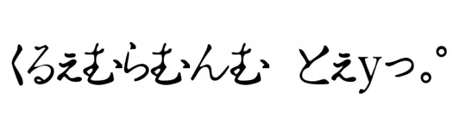
A playful, hand-drawn font with rounded edges and a consistent height.
 Scaricare 414 Downloads@WebFont
 -
![MegaMan Villanz font caratteri gratis]() Scaricare 414 Downloads@WebFont
Scaricare 414 Downloads@WebFont -
( JoeeCreative - Joe Creative - creativemarket.com/JoeeCreative )
A bold, elegant script font with flowing, cursive design.
![Denmahis font caratteri gratis]() Scaricare 414 Downloads@WebFont
Scaricare 414 Downloads@WebFont -
![Source Code Pro Italic font caratteri gratis]() Scaricare 414 Downloads@WebFont
Scaricare 414 Downloads@WebFont -
![Hiragana Tryout font caratteri gratis]() Scaricare 414 Downloads@WebFont
Scaricare 414 Downloads@WebFont -
-
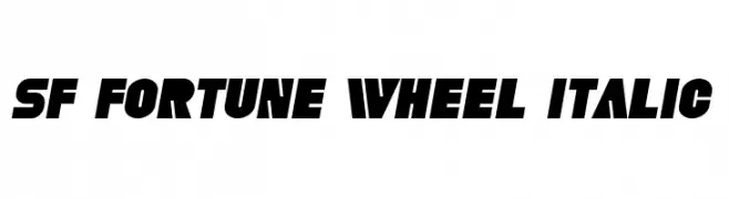
![SF Fortune Wheel Italic font caratteri gratis]() Scaricare 414 Downloads@WebFont
Scaricare 414 Downloads@WebFont -
( bogstav - www.bogstav.com )
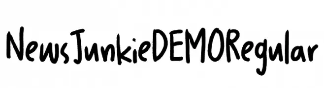
A bold, handwritten font with a casual and dynamic style.
![News Junkie DEMO Regular font caratteri gratis]() Scaricare 414 Downloads@WebFont
Scaricare 414 Downloads@WebFont -
![SteelTongs Italic font caratteri gratis]() Scaricare 414 Downloads@WebFont
Scaricare 414 Downloads@WebFont -
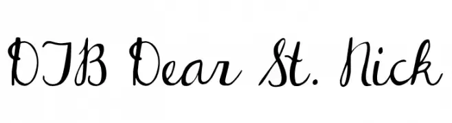
( Fonts by Darcy Baldwin - darcybaldwin.com. Free for personal use only )
A playful and whimsical script font with flowing, connected letters.
![DJB Dear St. Nick font caratteri gratis]() Scaricare 414 Downloads@WebFont
Scaricare 414 Downloads@WebFont -
( Fonts by Linafis Studio - Ahmad Fashihullisan - Personal-use only. For commercial use please contact owner. )
A bold, cracked texture font with a rugged, urban style.
![CRACK WALL Regular font caratteri gratis]() Scaricare 414 Downloads@WebFont
Scaricare 414 Downloads@WebFont -
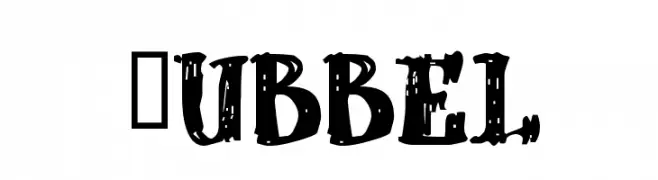
![dUBBEL font caratteri gratis]() Scaricare 414 Downloads@WebFont
Scaricare 414 Downloads@WebFont -
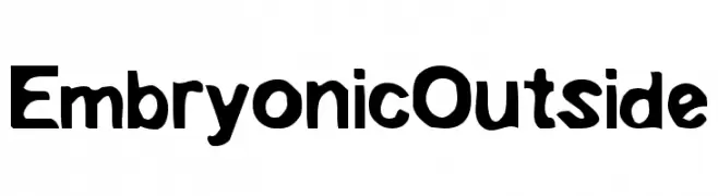
![EmbryonicOutside font caratteri gratis]() Scaricare 414 Downloads@WebFont
Scaricare 414 Downloads@WebFont -
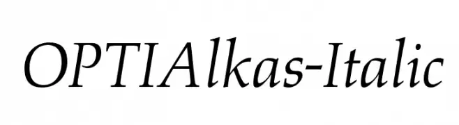
( Fonts by Castcraft Software - opti.netii.net - check the website before use )
An elegant italic serif font with moderate contrast and refined serifs.
![OPTIAlkas-Italic font caratteri gratis]() Scaricare 414 Downloads@WebFont
Scaricare 414 Downloads@WebFont -
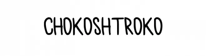
( Fonts by Pjer Pjer )
A playful, handwritten font with smooth, rounded edges and a friendly appearance.
![chokoshtroko font caratteri gratis]() Scaricare 414 Downloads@WebFont
Scaricare 414 Downloads@WebFont -
( Fonts by www.kiwi-media.com )
A jagged, gothic-style font with sharp, dramatic characters.
![Creepygirl font caratteri gratis]() Scaricare 414 Downloads@WebFont
Scaricare 414 Downloads@WebFont -
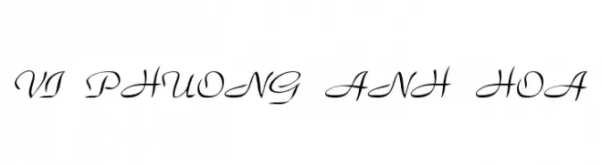
![VI Phuong Anh Hoa font caratteri gratis]() Scaricare 414 Downloads@WebFont
Scaricare 414 Downloads@WebFont -
( Fonts by Saridezra - Personal-use only. For commercial use please contact owner. )
A classic serif font with bold strokes and high contrast, perfect for formal and elegant designs.
![MandalikaDEMO font caratteri gratis]() Scaricare 414 Downloads@WebFont
Scaricare 414 Downloads@WebFont -
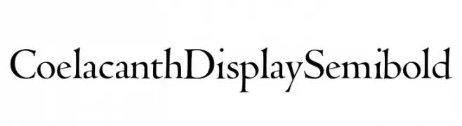
( Personal-use only. For commercial use please contact owner. )
A classic serif font with semi-bold weight and elegant, flared serifs.
![Coelacanth Display Semibold font caratteri gratis]() Scaricare 414 Downloads@WebFont
Scaricare 414 Downloads@WebFont -
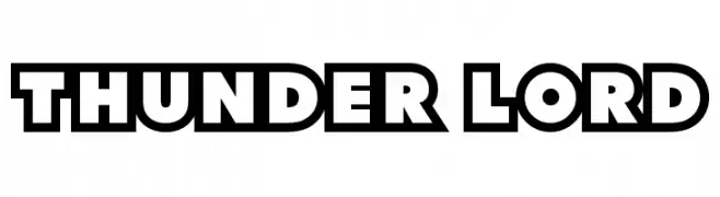
( Fonts by Sharkshock Productions----www.sharkshock.com. Personal-use only. For commercial use please contact owner. )
A bold, outlined display font with a comic book style.
![Thunder Lord font caratteri gratis]() Scaricare 414 Downloads@WebFont
Scaricare 414 Downloads@WebFont -
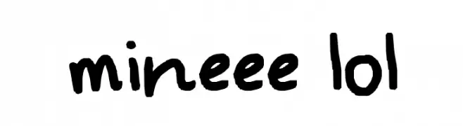
![mineee lol font caratteri gratis]() Scaricare 414 Downloads@WebFont
Scaricare 414 Downloads@WebFont -
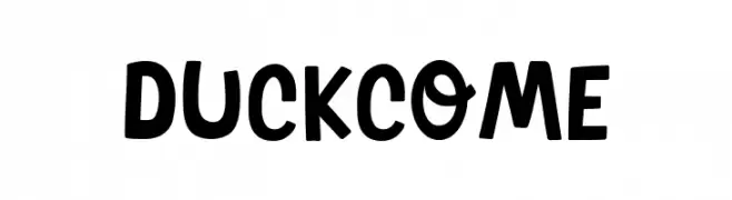
( Fonts by Khurasan )
A playful and bold font with rounded, quirky letterforms and consistent stroke width.
![Duck Come font caratteri gratis]() Scaricare 414 Downloads@WebFont
Scaricare 414 Downloads@WebFont -
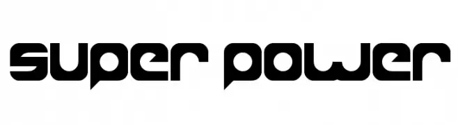
( Fonts by weknow - Wino S Kadir )
A bold, futuristic font with sharp angles and geometric shapes.
![super power font caratteri gratis]() Scaricare 414 Downloads@WebFont
Scaricare 414 Downloads@WebFont -
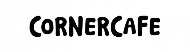
( Fonts by Khurasan )
A playful, bold font with rounded edges and a hand-drawn look.
![Corner Cafe font caratteri gratis]() Scaricare 414 Downloads@WebFont
Scaricare 414 Downloads@WebFont -
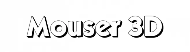
![Mouser 3D font caratteri gratis]() Scaricare 414 Downloads@WebFont
Scaricare 414 Downloads@WebFont -
![Viza font caratteri gratis]() Scaricare 414 Downloads
Scaricare 414 Downloads -
( Fonts by Andi Moz )
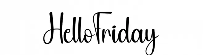
Playful handwritten script font.
![Hello Friday font caratteri gratis]() Scaricare 414 Downloads@WebFont
Scaricare 414 Downloads@WebFont -
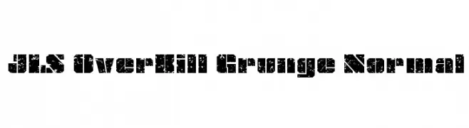
![JLS OverKill Grunge Normal font caratteri gratis]() Scaricare 414 Downloads@WebFont
Scaricare 414 Downloads@WebFont -
( Fonts by Manfred Klein. Free for private and charity use. Free for commercial with donation to organizations )
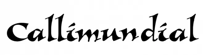
A dynamic, calligraphic font with sharp, angular strokes and high contrast.
![Callimundial font caratteri gratis]() Scaricare 414 Downloads@WebFont
Scaricare 414 Downloads@WebFont -
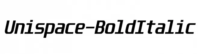
( Fonts by www.typodermicfonts.com - Ray Larabie )
A bold, italic sans-serif font with a modern and dynamic style.
![Unispace-BoldItalic font caratteri gratis]() Scaricare 414 Downloads@WebFont
Scaricare 414 Downloads@WebFont -
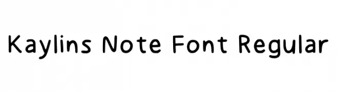
( Fonts by Kaylin )
Playful handwritten-style font.
![Kaylins Note Font Regular font caratteri gratis]() Scaricare 414 Downloads@WebFont
Scaricare 414 Downloads@WebFont -
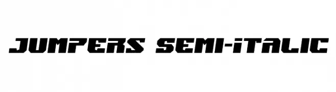
( Fonts by Iconian Fonts )
A bold, angular, semi-italic font with a dynamic and modern style.
![Jumpers Semi-Italic font caratteri gratis]() Scaricare 414 Downloads@WebFont
Scaricare 414 Downloads@WebFont -
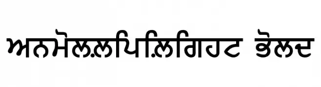
![AnmolLipiLight Bold font caratteri gratis]() Scaricare 414 Downloads@WebFont
Scaricare 414 Downloads@WebFont -
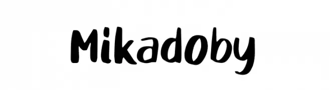
( Fonts by D&K Project )
A bold, playful handwritten font with thick strokes and dynamic shapes.
![Mikadoby font caratteri gratis]() Scaricare 414 Downloads@WebFont
Scaricare 414 Downloads@WebFont -
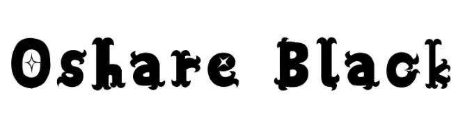
( Fonts by Baka - Kyakirun - bakafonts.kyakirun.com )
A bold, decorative font with intricate details and playful embellishments.
![Oshare Black font caratteri gratis]() Scaricare 414 Downloads@WebFont
Scaricare 414 Downloads@WebFont -
![Schneller font caratteri gratis]() Scaricare 414 Downloads@WebFont
Scaricare 414 Downloads@WebFont


Quali sono i font più popolari adesso?
Poppins, Roboto, Montserrat, Open Sans e Lato sono molto usati per le forme pulite e l'ampia applicabilità — dall'identità di marca alle landing page e ai poster.
Quali font si usano spesso nei loghi?
Le sans serif geometriche (es. Poppins, famiglie in stile Gotham) sono scelte comuni per un branding pulito e scalabile. Per un tocco personale restano valide script e stili manoscritti. Abbina un display deciso per i titoli a un corpo testo neutro per riconoscibilità ed equilibrio.
Ogni quanto si aggiorna la lista?
Con regolarità, in base ai download e all'attività reale. Torna spesso per scoprire in anticipo le nuove preferite.
💡 Consiglio: aggiungi ai preferiti — le tendenze cambiano in fretta e i font top di oggi possono ispirare il rebranding di domani.