Benvenuto nelle Font Più Popolari — dove popolarità e qualità si incontrano. Qui trovi i font più scaricati e usati dell'anno. Se cerchi scelte sicure per logo, web o social, inizia da qui.
Ogni font top si distingue per equilibrio, leggibilità e versatilità. Troverai sans serif moderne, script eleganti, serif vintage e display minimalisti.
-
( Font by Jayvee D. Enaguas - grandchaos9000.deviantart.com )
A bold, modern typeface with strong, thick strokes for impactful design.
 Scaricare 2347 Downloads@WebFont
 -
( Fonts by David Rakowski )
A classic serif font with elegant curves and refined aesthetics.
![Garton font caratteri gratis]() Scaricare 2347 Downloads@WebFont
Scaricare 2347 Downloads@WebFont -
![AndrewScript font caratteri gratis]() Scaricare 2347 Downloads@WebFont
Scaricare 2347 Downloads@WebFont -
![Metro Nouveau font caratteri gratis]() Scaricare 2347 Downloads@WebFont
Scaricare 2347 Downloads@WebFont -
Caratteri di freedesignclub. For commercial use please contact the owner.
( Jelly Belly Font )
A playful, bold font with rounded, bubble-like characters and a glossy appearance.
![JellyBelly Font Regular font caratteri gratis]() Scaricare 2346 Downloads@WebFont
Scaricare 2346 Downloads@WebFont -
-
( Sabrtype - creativemarket.com/Sabrtype )
A bold, condensed font with a modern and impactful style.
![Abraham font caratteri gratis]() Scaricare 2346 Downloads@WebFont
Scaricare 2346 Downloads@WebFont -
( Copyright 2009 The Cairo Project Authors (gaber@gaberism.net) )
A modern, clean sans-serif font with geometric shapes and consistent stroke width.
![Cairo ExtraLight font caratteri gratis]() Scaricare 2346 Downloads@WebFont
Scaricare 2346 Downloads@WebFont -
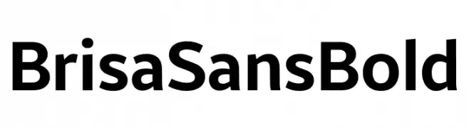
( Fonts by Dalton Maag Ltd - Personal-use only. For commercial use please contact owner. )
A modern, bold sans-serif typeface with excellent readability and versatility.
![Brisa Sans Bold font caratteri gratis]() Scaricare 2345 Downloads@WebFont
Scaricare 2345 Downloads@WebFont -
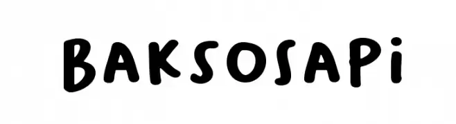
( Locomotype - Arwan Sutanto - www.locomotype.com )
A playful, bold font with a hand-drawn, rounded style.
![BaksoSapi font caratteri gratis]() Scaricare 2345 Downloads@WebFont
Scaricare 2345 Downloads@WebFont -
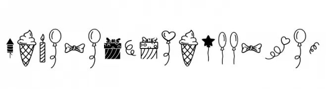
( Fonts by Situjuh Nazara - 7ntypes.com - Personal-use only. For commercial use please contact owner. )
A playful collection of hand-drawn doodles featuring festive elements like balloons and cupcakes.
![Habede Extra Doodles font caratteri gratis]() Scaricare 2344 Downloads@WebFont
Scaricare 2344 Downloads@WebFont -
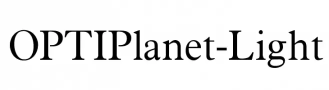
( Fonts by Castcraft Software - OPTI Fonts Archive - opti.netii.net - Personal-use only. For commercial use please contact owner. )
A classic serif font with elegant, refined strokes and a light weight.
![OPTIPlanet-Light font caratteri gratis]() Scaricare 2344 Downloads@WebFont
Scaricare 2344 Downloads@WebFont -
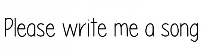
( Fonts by Vanessa Bays - bythebutterfly.com )
A playful, hand-drawn font with rounded edges and a whimsical style.
![Please write me a song font caratteri gratis]() Scaricare 2344 Downloads@WebFont
Scaricare 2344 Downloads@WebFont -
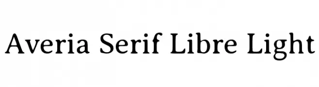
( Copyright (c) 2011, Dan Sayers (i@iotic.com) )
A light serif font with elegant curves and subtle contrast, perfect for readability.
![Averia Serif Libre Light font caratteri gratis]() Scaricare 2344 Downloads@WebFont
Scaricare 2344 Downloads@WebFont -
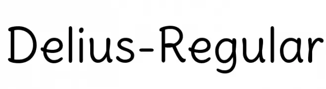
( Copyright (c) 2010, 2011, Natalia Raices )
A playful, rounded font with smooth, consistent strokes and a friendly appearance.
![Delius-Regular font caratteri gratis]() Scaricare 2344 Downloads@WebFont
Scaricare 2344 Downloads@WebFont -
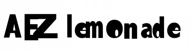
( Fonts by Adult Ramblings - Anastacia E. Zittel - Personal-use only. For commercial use please contact owner. )
A bold, modern font with thick strokes and a commanding presence.
![AEZlemonade font caratteri gratis]() Scaricare 2344 Downloads@WebFont
Scaricare 2344 Downloads@WebFont -
![MarketBold font caratteri gratis]() Scaricare 2344 Downloads
Scaricare 2344 Downloads -
( Alexander Pravdin )
A bold, semi-expanded sans-serif font with a modern and impactful style.
![SONGERSemiExpanded-Heavy font caratteri gratis]() Scaricare 2343 Downloads@WebFont
Scaricare 2343 Downloads@WebFont -
( Fonts by weknow - Wino S Kadir )
A playful, rounded font with smooth curves and consistent stroke width.
![gitchgitch font caratteri gratis]() Scaricare 2343 Downloads@WebFont
Scaricare 2343 Downloads@WebFont -
( Fonts by David Rakowski )
A bold, stencil-like font with high contrast and a modern, industrial style.
![Lintsec Medium font caratteri gratis]() Scaricare 2343 Downloads
Scaricare 2343 Downloads -
![Cassandra Regular font caratteri gratis]() Scaricare 2343 Downloads@WebFont
Scaricare 2343 Downloads@WebFont -
( Fonts by MadeType - Personal-use only. For commercial use please contact owner. )
A bold, rounded font with a modern and friendly style.
![MADEWaffleSoft font caratteri gratis]() Scaricare 2342 Downloads@WebFont
Scaricare 2342 Downloads@WebFont -
![newFont-Regular font caratteri gratis]() Scaricare 2342 Downloads@WebFont
Scaricare 2342 Downloads@WebFont -
( Fonts by www.kimberlygeswein.com - Kimberly Geswein )
A playful, rounded font with a handwritten style, ideal for educational materials.
![KG Primary Penmanship font caratteri gratis]() Scaricare 2342 Downloads@WebFont
Scaricare 2342 Downloads@WebFont -
![Damned Architect font caratteri gratis]() Scaricare 2342 Downloads@WebFont
Scaricare 2342 Downloads@WebFont -
( Copyright (c) 2012, vernon adams (vern@newtypography.co.uk), with Reserved Font Names 'Oxygen' )
A modern, geometric sans-serif font with excellent legibility.
![Oxygen Regular font caratteri gratis]() Scaricare 2341 Downloads@WebFont
Scaricare 2341 Downloads@WebFont -
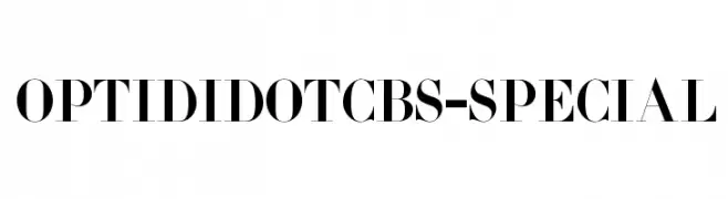
( Fonts by Castcraft Software - opti.netii.net - check the website before use )
A modern serif typeface with high contrast and elegant, refined serifs.
![OPTIDidotCBS-Special font caratteri gratis]() Scaricare 2341 Downloads@WebFont
Scaricare 2341 Downloads@WebFont -
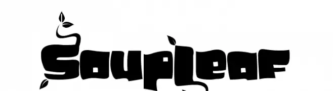
![SoupLeaf font caratteri gratis]() Scaricare 2341 Downloads@WebFont
Scaricare 2341 Downloads@WebFont -
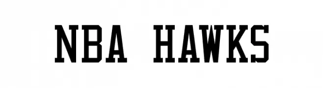
![NBA Hawks font caratteri gratis]() Scaricare 2340 Downloads@WebFont
Scaricare 2340 Downloads@WebFont -
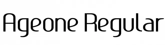
![Ageone Regular font caratteri gratis]() Scaricare 2340 Downloads@WebFont
Scaricare 2340 Downloads@WebFont -
![Nikodecs font caratteri gratis]() Scaricare 2339 Downloads@WebFont
Scaricare 2339 Downloads@WebFont -
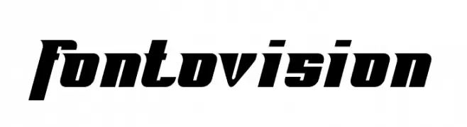
( Fonts by Dieter Schumacher )
A bold, angular font with a dynamic, modern style.
![Fontovision font caratteri gratis]() Scaricare 2339 Downloads@WebFont
Scaricare 2339 Downloads@WebFont -
( Copyright 2013 Seoul Metropolitan Government (gonabis@seoul.go.kr) )
A bold, modern sans-serif typeface with excellent readability.
![SeoulNamsan EB font caratteri gratis]() Scaricare 2338 Downloads@WebFont
Scaricare 2338 Downloads@WebFont -
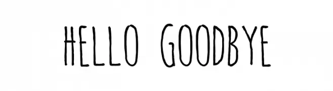
( Fonts by Ariq Sya - marsnev.com )
A playful, handwritten font with tall, narrow letters and irregular strokes.
![hello goodbye font caratteri gratis]() Scaricare 2338 Downloads@WebFont
Scaricare 2338 Downloads@WebFont -
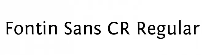
( A font by Jos Buivenga (exljbris) -> www.exljbris.com )
A clean, modern sans-serif font with excellent readability and versatility.
![Fontin Sans CR Regular font caratteri gratis]() Scaricare 2338 Downloads@WebFont
Scaricare 2338 Downloads@WebFont -
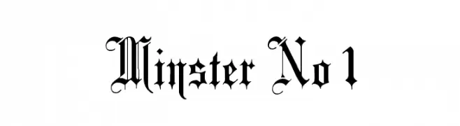
( Fonts by Paul Lloyd )
A classic blackletter font with ornate, historical elegance.
![Minster No 1 font caratteri gratis]() Scaricare 2338 Downloads@WebFont
Scaricare 2338 Downloads@WebFont


Quali sono i font più popolari adesso?
Poppins, Roboto, Montserrat, Open Sans e Lato sono molto usati per le forme pulite e l'ampia applicabilità — dall'identità di marca alle landing page e ai poster.
Quali font si usano spesso nei loghi?
Le sans serif geometriche (es. Poppins, famiglie in stile Gotham) sono scelte comuni per un branding pulito e scalabile. Per un tocco personale restano valide script e stili manoscritti. Abbina un display deciso per i titoli a un corpo testo neutro per riconoscibilità ed equilibrio.
Ogni quanto si aggiorna la lista?
Con regolarità, in base ai download e all'attività reale. Torna spesso per scoprire in anticipo le nuove preferite.
💡 Consiglio: aggiungi ai preferiti — le tendenze cambiano in fretta e i font top di oggi possono ispirare il rebranding di domani.