Benvenuto nelle Font Più Popolari — dove popolarità e qualità si incontrano. Qui trovi i font più scaricati e usati dell'anno. Se cerchi scelte sicure per logo, web o social, inizia da qui.
Ogni font top si distingue per equilibrio, leggibilità e versatilità. Troverai sans serif moderne, script eleganti, serif vintage e display minimalisti.
-
( James Barnardo )
A bold, slanted font with a dynamic and modern style.
 Scaricare 1220 Downloads@WebFont
 -
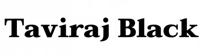
( Copyright (c) 2015, Cadson Demak (info@cadsondemak.com) )
A bold serif font with strong strokes and a classic yet modern style.
![Taviraj Black font caratteri gratis]() Scaricare 1220 Downloads@WebFont
Scaricare 1220 Downloads@WebFont -
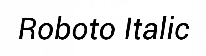
( Fonts by developer.android.com )
A modern, italicized sans-serif font with clean lines and balanced proportions.
![Roboto Italic font caratteri gratis]() Scaricare 1220 Downloads@WebFont
Scaricare 1220 Downloads@WebFont -
![Saturday Night font caratteri gratis]() Scaricare 1220 Downloads@WebFont
Scaricare 1220 Downloads@WebFont -
![BTSE + PS2 FONT font caratteri gratis]() Scaricare 1220 Downloads@WebFont
Scaricare 1220 Downloads@WebFont -
-
Caratteri di JuanCasco. For commercial use please contact the owner.
( Fonts by Juan Casco - www.juancasco.net )
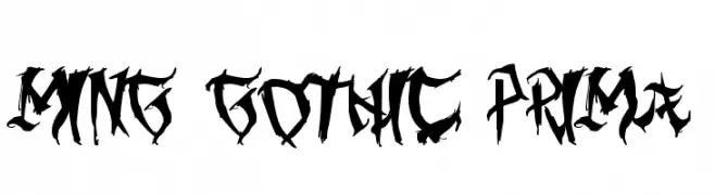
A bold, jagged gothic font with sharp, angular characters.
![Ming Gothic Prima font caratteri gratis]() Scaricare 1220 Downloads@WebFont
Scaricare 1220 Downloads@WebFont -
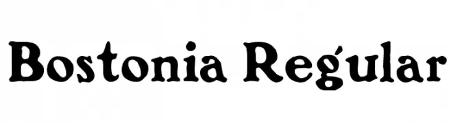
![Bostonia Regular font caratteri gratis]() Scaricare 1220 Downloads@WebFont
Scaricare 1220 Downloads@WebFont -
( Fonts by Iconian Fonts - Daniel Zadorozny )
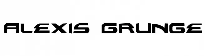
A bold, angular font with a modern, industrial style.
![Alexis Grunge font caratteri gratis]() Scaricare 1220 Downloads@WebFont
Scaricare 1220 Downloads@WebFont -
( Fonts by www.movefont .com - Personal-use only. For commercial use please contact owner. )
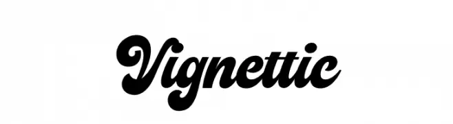
A bold, flowing script font with elegant curves and a modern touch.
![Vignettic font caratteri gratis]() Scaricare 1219 Downloads@WebFont
Scaricare 1219 Downloads@WebFont -
( Fonts by Situjuh Nazara - 7ntypes.com - Personal-use only. For commercial use please contact owner. )
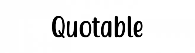
A playful, rounded font with bold, smooth curves and a friendly appearance.
![Quotable font caratteri gratis]() Scaricare 1219 Downloads@WebFont
Scaricare 1219 Downloads@WebFont -
( Fonts by Geronimo Fonts - Personal-use only. For commercial use please contact owner. )
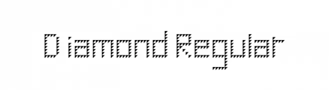
A geometric, zigzag-patterned font with a bold and artistic style.
![Diamond Regular font caratteri gratis]() Scaricare 1219 Downloads@WebFont
Scaricare 1219 Downloads@WebFont -
( Fonts by www.love-letters.be. Personal-use only. For commercial use please contact owner. )
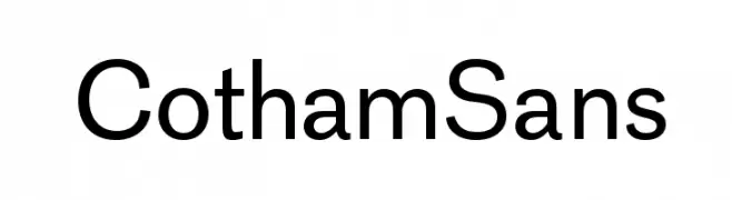
A modern, clean sans-serif font with balanced stroke width and excellent readability.
![CothamSans font caratteri gratis]() Scaricare 1219 Downloads@WebFont
Scaricare 1219 Downloads@WebFont -
( Fonts by Galdino Otten - galdinootten.com )
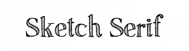
A sketch-style serif font with a hand-drawn, textured appearance.
![Sketch Serif font caratteri gratis]() Scaricare 1219 Downloads@WebFont
Scaricare 1219 Downloads@WebFont -
( Fonts by Sharkshock Productions----www.sharkshock.com. Personal-use only. For commercial use please contact owner. )
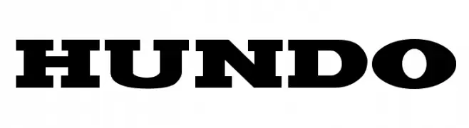
A bold, modern font with thick strokes and a strong presence.
![Hundo font caratteri gratis]() Scaricare 1219 Downloads@WebFont
Scaricare 1219 Downloads@WebFont -
( Fonts by a Neale Davidson - www.pixelsagas.com. Personal-use only. For commercial use please contact owner. )
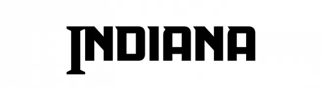
A bold, geometric font with a modern and powerful aesthetic.
![Indiana font caratteri gratis]() Scaricare 1219 Downloads@WebFont
Scaricare 1219 Downloads@WebFont -
![AveriaSans-Regular font caratteri gratis]() Scaricare 1219 Downloads@WebFont
Scaricare 1219 Downloads@WebFont -
( Fonts by David Kerkhoff - www.hanodedphotography.com )
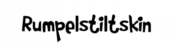
A playful, hand-drawn font with bold, rounded characters and a whimsical style.
![Rumpelstiltskin font caratteri gratis]() Scaricare 1219 Downloads@WebFont
Scaricare 1219 Downloads@WebFont -
![Freakomix font caratteri gratis]() Scaricare 1219 Downloads@WebFont
Scaricare 1219 Downloads@WebFont -
( Fonts by Graham Meade - GemFonts )
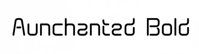
A modern, geometric font with rounded edges and a monospaced style.
![Aunchanted Bold font caratteri gratis]() Scaricare 1219 Downloads@WebFont
Scaricare 1219 Downloads@WebFont -
( Fonts by Apostrophic Lab )
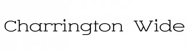
A modern, wide-stanced font with clean lines and balanced proportions.
![Charrington Wide font caratteri gratis]() Scaricare 1219 Downloads@WebFont
Scaricare 1219 Downloads@WebFont -
![04b_30 font caratteri gratis]() Scaricare 1219 Downloads@WebFont
Scaricare 1219 Downloads@WebFont -
( Fonts by GGBotNet )
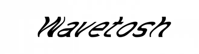
A bold, slanted script font with dynamic and fluid characteristics.
![Wavetosh font caratteri gratis]() Scaricare 1218 Downloads@WebFont
Scaricare 1218 Downloads@WebFont -
( Fonts by Hanoded )
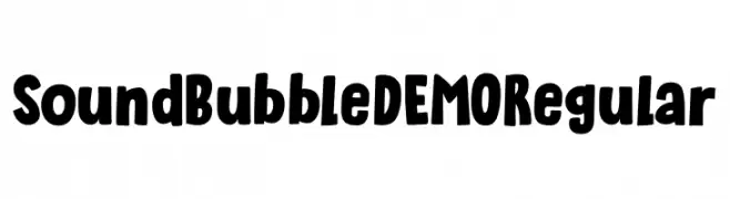
A playful, bold font with rounded, bubbly characters.
![Sound Bubble DEMO Regular font caratteri gratis]() Scaricare 1218 Downloads@WebFont
Scaricare 1218 Downloads@WebFont -
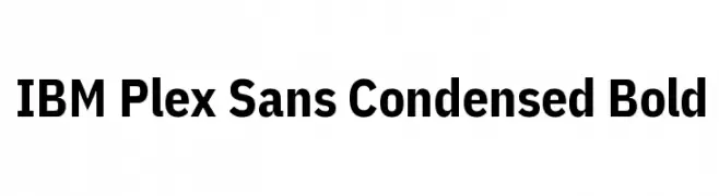
( Copyright © 2017 IBM Corp. with Reserved Font Name "Plex" )
A modern, bold, and condensed sans-serif typeface with a clean and professional look.
![IBM Plex Sans Condensed Bold font caratteri gratis]() Scaricare 1218 Downloads@WebFont
Scaricare 1218 Downloads@WebFont -
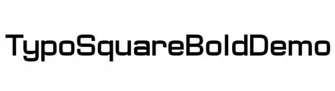
( Fonts by www.studiotypo.com - Personal-use only. For commercial use please contact owner. )
A bold, geometric font with a modern and structured design.
![Typo Square Bold Demo font caratteri gratis]() Scaricare 1218 Downloads@WebFont
Scaricare 1218 Downloads@WebFont -
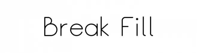
( Fonts by Rajesh Rajput - www.behance.net/rajputrajesh - Personal-use only. For commercial use please contact owner. )
A modern, geometric font with clean lines and a minimalist style.
![Break Fill font caratteri gratis]() Scaricare 1218 Downloads@WebFont
Scaricare 1218 Downloads@WebFont -
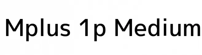
( Copyright 2016 The M+ Project Authors. )
A modern, geometric sans-serif font with uniform strokes and clean lines.
![Mplus 1p Medium font caratteri gratis]() Scaricare 1218 Downloads@WebFont
Scaricare 1218 Downloads@WebFont -
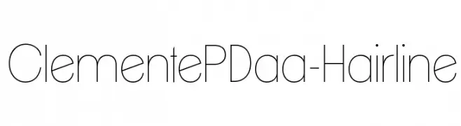
![ClementePDaa-Hairline font caratteri gratis]() Scaricare 1218 Downloads@WebFont
Scaricare 1218 Downloads@WebFont -
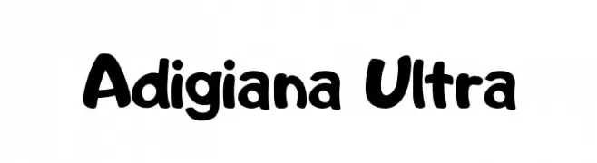
![Adigiana Ultra font caratteri gratis]() Scaricare 1218 Downloads@WebFont
Scaricare 1218 Downloads@WebFont -
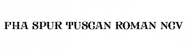
![FHA Spur Tuscan Roman NCV font caratteri gratis]() Scaricare 1218 Downloads@WebFont
Scaricare 1218 Downloads@WebFont -
( Fonts by a Max Infeld - XEROGRAPHER FONTS - xerographer.blogspot.com . Personal-use only. For commercial use please contact owner. )
A bold, 3D block font with a textured, industrial appearance.
![Gotcha font caratteri gratis]() Scaricare 1218 Downloads@WebFont
Scaricare 1218 Downloads@WebFont -
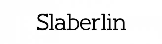
( Fonts by antoniorodriguesjr.com )
A bold slab serif font with strong lines and a modern touch.
![Slaberlin font caratteri gratis]() Scaricare 1218 Downloads@WebFont
Scaricare 1218 Downloads@WebFont -
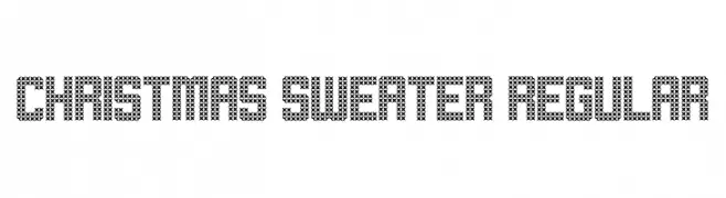
( Fonts by Geronimo )
A festive, knitted-style font perfect for holiday-themed designs.
![Christmas Sweater Regular font caratteri gratis]() Scaricare 1218 Downloads@WebFont
Scaricare 1218 Downloads@WebFont -
![Banana font caratteri gratis]() Scaricare 1218 Downloads@WebFont
Scaricare 1218 Downloads@WebFont -
( گالری فانت فارسی پژوهش آريانا - only compatible with Farsi and Arabic )
A classic serif font with elegant strokes and multilingual support.
![Ohod I font caratteri gratis]() Scaricare 1218 Downloads@WebFont
Scaricare 1218 Downloads@WebFont


Quali sono i font più popolari adesso?
Poppins, Roboto, Montserrat, Open Sans e Lato sono molto usati per le forme pulite e l'ampia applicabilità — dall'identità di marca alle landing page e ai poster.
Quali font si usano spesso nei loghi?
Le sans serif geometriche (es. Poppins, famiglie in stile Gotham) sono scelte comuni per un branding pulito e scalabile. Per un tocco personale restano valide script e stili manoscritti. Abbina un display deciso per i titoli a un corpo testo neutro per riconoscibilità ed equilibrio.
Ogni quanto si aggiorna la lista?
Con regolarità, in base ai download e all'attività reale. Torna spesso per scoprire in anticipo le nuove preferite.
💡 Consiglio: aggiungi ai preferiti — le tendenze cambiano in fretta e i font top di oggi possono ispirare il rebranding di domani.