Benvenuto nelle Font Più Popolari — dove popolarità e qualità si incontrano. Qui trovi i font più scaricati e usati dell'anno. Se cerchi scelte sicure per logo, web o social, inizia da qui.
Ogni font top si distingue per equilibrio, leggibilità e versatilità. Troverai sans serif moderne, script eleganti, serif vintage e display minimalisti.
-
 Scaricare 1141 Downloads@WebFont
 -
( Fonts by www.chequered.ink - Chequered Ink - Personal-use only. For commercial use please contact owner. )
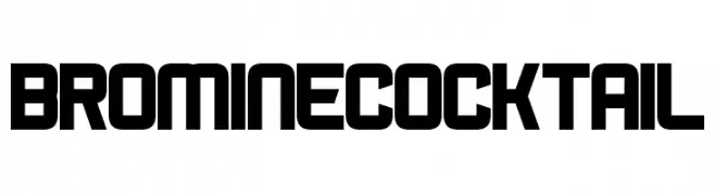
A bold, geometric font with uniform stroke widths and a modern design.
![Bromine Cocktail font caratteri gratis]() Scaricare 1141 Downloads@WebFont
Scaricare 1141 Downloads@WebFont -
( Fonts by www.chequered.ink - Chequered Ink - Personal-use only. For commercial use please contact owner. )
A bold, geometric font with sharp angles and a futuristic aesthetic.
![Pimlico font caratteri gratis]() Scaricare 1141 Downloads@WebFont
Scaricare 1141 Downloads@WebFont -
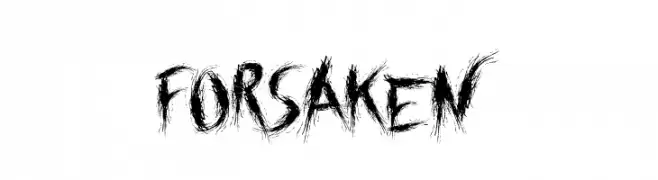
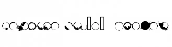
![Forsaken font caratteri gratis]() Scaricare 1141 Downloads@WebFont
Scaricare 1141 Downloads@WebFont -
( Fonts by Måns Grebäck )
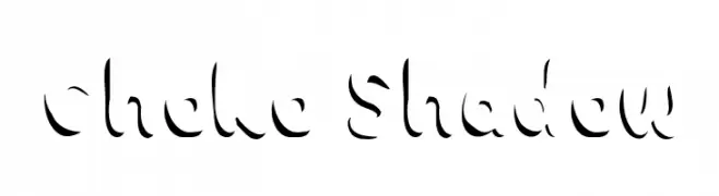
A playful, shadowed font with a bold, artistic style.
![Choko Shadow font caratteri gratis]() Scaricare 1141 Downloads@WebFont
Scaricare 1141 Downloads@WebFont -
-
![Bluebird font caratteri gratis]() Scaricare 1141 Downloads@WebFont
Scaricare 1141 Downloads@WebFont -
![DKAbelia font caratteri gratis]() Scaricare 1141 Downloads@WebFont
Scaricare 1141 Downloads@WebFont -
![Wall IT font caratteri gratis]() Scaricare 1141 Downloads@WebFont
Scaricare 1141 Downloads@WebFont -
![101! Celtic Astrologer font caratteri gratis]() Scaricare 1141 Downloads@WebFont
Scaricare 1141 Downloads@WebFont -
( Fonts by www.typodermicfonts.com - Ray Larabie )
A bold, italic font with a dynamic and sporty style.
![BullpenHv-Italic font caratteri gratis]() Scaricare 1141 Downloads@WebFont
Scaricare 1141 Downloads@WebFont -
![butteler font caratteri gratis]() Scaricare 1141 Downloads@WebFont
Scaricare 1141 Downloads@WebFont -
![Varsity Regular:001.001 font caratteri gratis]() Scaricare 1141 Downloads@WebFont
Scaricare 1141 Downloads@WebFont -
( Fonts by www.fontalicious.com )
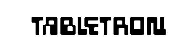
A bold, geometric font with a futuristic and cohesive design.
![Tabletron font caratteri gratis]() Scaricare 1141 Downloads@WebFont
Scaricare 1141 Downloads@WebFont -
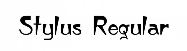
![Stylus Regular font caratteri gratis]() Scaricare 1141 Downloads@WebFont
Scaricare 1141 Downloads@WebFont -
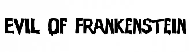
![Evil Of Frankenstein font caratteri gratis]() Scaricare 1141 Downloads@WebFont
Scaricare 1141 Downloads@WebFont -
( Fonts by Julieta Ulanovsky - Personal-use only. For commercial use please contact owner. )
A modern, geometric sans-serif font with clean lines and balanced proportions.
![Montserrat Ace Light font caratteri gratis]() Scaricare 1140 Downloads@WebFont
Scaricare 1140 Downloads@WebFont -
( Fonts by Alex Slobzheninov - Personal-use only. For commercial use please contact owner. )
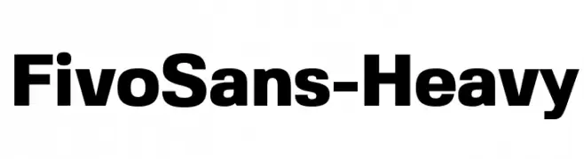
A bold, modern sans-serif font with a strong, uniform appearance.
![FivoSans-Heavy font caratteri gratis]() Scaricare 1140 Downloads@WebFont
Scaricare 1140 Downloads@WebFont -
( Fonts by Paul James Miller - Personal-use only. For commercial use please contact owner. )
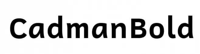
A bold, modern sans-serif font with clean lines and balanced spacing.
![Cadman Bold font caratteri gratis]() Scaricare 1140 Downloads@WebFont
Scaricare 1140 Downloads@WebFont -
( Doug Sheets - dougsheets.com )
Bold, uppercase font with a modern and impactful style.
![Coffee Shop Bold Small Cap font caratteri gratis]() Scaricare 1140 Downloads@WebFont
Scaricare 1140 Downloads@WebFont -
( Craft Supply Co. - creativemarket.com/craftsupplyco )
A bold, geometric font with tall, narrow letters and sharp angles.
![Houston font caratteri gratis]() Scaricare 1140 Downloads@WebFont
Scaricare 1140 Downloads@WebFont -
![The CheddarCake Factory font caratteri gratis]() Scaricare 1140 Downloads@WebFont
Scaricare 1140 Downloads@WebFont -
![123 font caratteri gratis]() Scaricare 1140 Downloads@WebFont
Scaricare 1140 Downloads@WebFont -
( Copyright (c) 2011, Cyreal (www.cyreal.org) )
A bold, geometric font with sharp angles and a modern, futuristic style.
![Iceberg font caratteri gratis]() Scaricare 1140 Downloads@WebFont
Scaricare 1140 Downloads@WebFont -
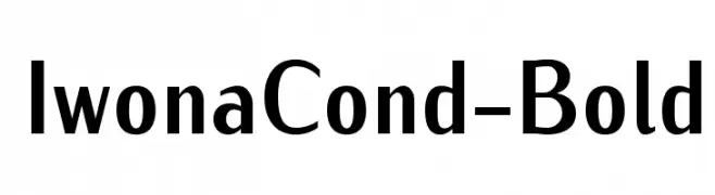
![IwonaCond-Bold font caratteri gratis]() Scaricare 1140 Downloads@WebFont
Scaricare 1140 Downloads@WebFont -
![LipiExpand font caratteri gratis]() Scaricare 1140 Downloads@WebFont
Scaricare 1140 Downloads@WebFont -
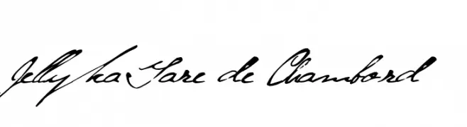
( Fonts are free for a personal use only - www.cuttyfruty.com )
A whimsical, elegant cursive font with flowing, artistic strokes.
![Jellyka Gare de Chambord font caratteri gratis]() Scaricare 1140 Downloads@WebFont
Scaricare 1140 Downloads@WebFont -
![Cafeina Dig_v2 Normal font caratteri gratis]() Scaricare 1140 Downloads@WebFont
Scaricare 1140 Downloads@WebFont -
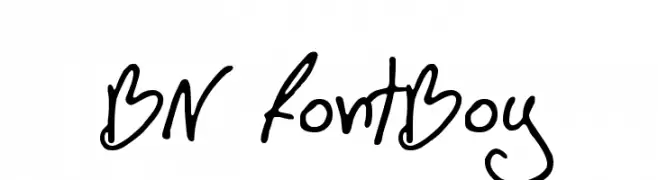
( Font by Ben Nathan - www.hafontia.com )
A playful, handwritten font with fluid, dynamic strokes and a casual style.
![BN FontBoy font caratteri gratis]() Scaricare 1140 Downloads@WebFont
Scaricare 1140 Downloads@WebFont -
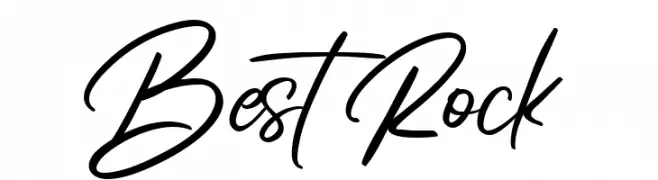
( Fonts by Muhammad Sirojuddin - lettersiro.com - Personal-use only. For commercial use please contact owner. )
A dynamic and expressive handwritten font with fluid, continuous strokes.
![Best Rock font caratteri gratis]() Scaricare 1139 Downloads@WebFont
Scaricare 1139 Downloads@WebFont -
( Fonts by Vernon Adams - Personal-use only. For commercial use please contact owner. )
A sleek, modern font with a subtle italic slant and consistent stroke weight.
![Oswald LightItalic font caratteri gratis]() Scaricare 1139 Downloads@WebFont
Scaricare 1139 Downloads@WebFont -
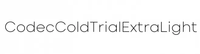
( Zetafonts - www.zetafonts.com )
A minimalist, geometric sans-serif font with thin, uniform strokes.
![Codec Cold Trial ExtraLight font caratteri gratis]() Scaricare 1139 Downloads@WebFont
Scaricare 1139 Downloads@WebFont -
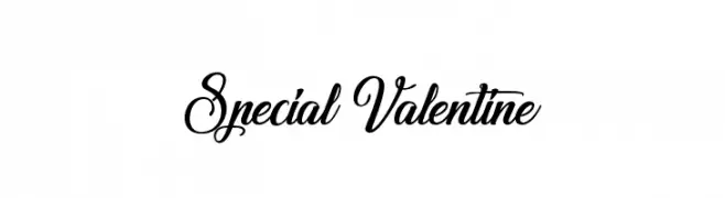
( Fonts by Agathe M.Joyce - www.foundmyfont.com - Personal-use only. For commercial use please contact owner. )
An elegant script font with flowing, interconnected letterforms and ornate flourishes.
![Special Valentine font caratteri gratis]() Scaricare 1139 Downloads@WebFont
Scaricare 1139 Downloads@WebFont -
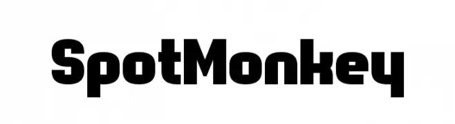
( Fonts by www.chequered.ink - Chequered Ink - Personal-use only. For commercial use please contact owner. )
A bold, modern font with thick, blocky characters and a strong presence.
![Spot Monkey font caratteri gratis]() Scaricare 1139 Downloads@WebFont
Scaricare 1139 Downloads@WebFont -
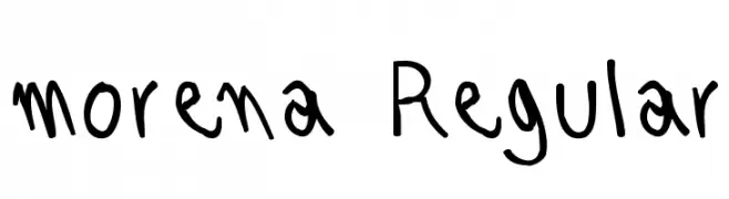
( Fonts by Nico Cardenas )
A playful, casual handwritten font with irregular strokes and a whimsical appearance.
![morena Regular font caratteri gratis]() Scaricare 1139 Downloads@WebFont
Scaricare 1139 Downloads@WebFont -
![destain font caratteri gratis]() Scaricare 1139 Downloads@WebFont
Scaricare 1139 Downloads@WebFont


Quali sono i font più popolari adesso?
Poppins, Roboto, Montserrat, Open Sans e Lato sono molto usati per le forme pulite e l'ampia applicabilità — dall'identità di marca alle landing page e ai poster.
Quali font si usano spesso nei loghi?
Le sans serif geometriche (es. Poppins, famiglie in stile Gotham) sono scelte comuni per un branding pulito e scalabile. Per un tocco personale restano valide script e stili manoscritti. Abbina un display deciso per i titoli a un corpo testo neutro per riconoscibilità ed equilibrio.
Ogni quanto si aggiorna la lista?
Con regolarità, in base ai download e all'attività reale. Torna spesso per scoprire in anticipo le nuove preferite.
💡 Consiglio: aggiungi ai preferiti — le tendenze cambiano in fretta e i font top di oggi possono ispirare il rebranding di domani.