Benvenuto nelle Font Più Popolari — dove popolarità e qualità si incontrano. Qui trovi i font più scaricati e usati dell'anno. Se cerchi scelte sicure per logo, web o social, inizia da qui.
Ogni font top si distingue per equilibrio, leggibilità e versatilità. Troverai sans serif moderne, script eleganti, serif vintage e display minimalisti.
-
 Scaricare 1132 Downloads@WebFont
 -
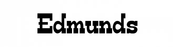
![Edmunds font caratteri gratis]() Scaricare 1132 Downloads@WebFont
Scaricare 1132 Downloads@WebFont -
( Fonts by Fontfabric - Svetoslav Simov - Personal-use only. For commercial use please contact owner. )
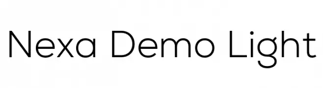
A modern, geometric sans-serif font with a clean and sleek design.
![Nexa Demo Light font caratteri gratis]() Scaricare 1131 Downloads@WebFont
Scaricare 1131 Downloads@WebFont -
( Fonts by Khurasan )
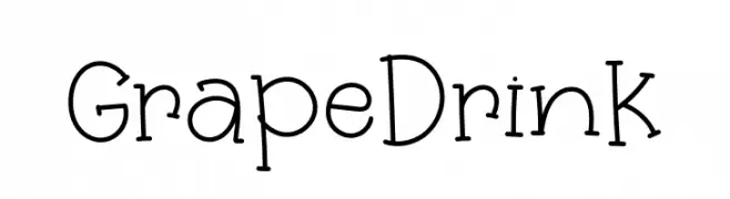
A playful, hand-drawn font with a whimsical and friendly style.
![Grape Drink font caratteri gratis]() Scaricare 1131 Downloads@WebFont
Scaricare 1131 Downloads@WebFont -
Caratteri di KidzBopFan2019. For commercial use please contact the owner.
( Big and small Caps )
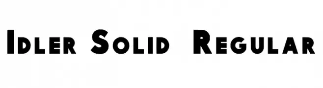
A bold, geometric font with clean lines and strong presence, ideal for modern designs.
![Idler Solid 15 Regular font caratteri gratis]() Scaricare 1131 Downloads@WebFont
Scaricare 1131 Downloads@WebFont -
-
( Fonts by David Jonathan Ross - Personal-use only. For commercial use please contact owner. )
A bold, inline font with a geometric and decorative style.
![Bungee Inline font caratteri gratis]() Scaricare 1131 Downloads@WebFont
Scaricare 1131 Downloads@WebFont -
( Fonts by www.peter-wiegel.de - Personal-use only. For commercial use please contact owner. )
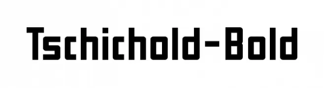
A bold, geometric font with clean lines and strong presence.
![Tschichold-Bold font caratteri gratis]() Scaricare 1131 Downloads@WebFont
Scaricare 1131 Downloads@WebFont -
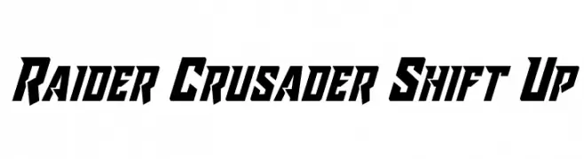
![Raider Crusader Shift Up font caratteri gratis]() Scaricare 1131 Downloads@WebFont
Scaricare 1131 Downloads@WebFont -
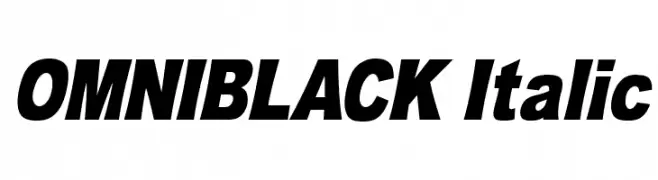
![OMNIBLACK Italic font caratteri gratis]() Scaricare 1131 Downloads@WebFont
Scaricare 1131 Downloads@WebFont -
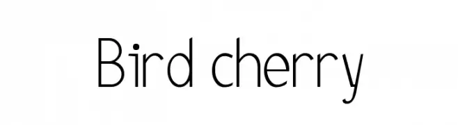
![Bird cherry font caratteri gratis]() Scaricare 1131 Downloads@WebFont
Scaricare 1131 Downloads@WebFont -
![Megalomania Normal font caratteri gratis]() Scaricare 1131 Downloads@WebFont
Scaricare 1131 Downloads@WebFont -
( Fonts by Fernando Haro - Personal-use only. For commercial use please contact owner. )
A bold, italicized font with a modern and dynamic style.
![Secuela-ExtraBoldItalic font caratteri gratis]() Scaricare 1130 Downloads@WebFont
Scaricare 1130 Downloads@WebFont -
( Solidtype - bit.ly/2OxZn2V )
An elegant script font with fluid, cursive strokes and decorative loops.
![Gredom font caratteri gratis]() Scaricare 1130 Downloads@WebFont
Scaricare 1130 Downloads@WebFont -
( Geronimo Font Studios - Geronimo )
A bold, geometric font with a modern, industrial style.
![War of 1930 Regular font caratteri gratis]() Scaricare 1130 Downloads@WebFont
Scaricare 1130 Downloads@WebFont -
( Barland - creativemarket.com/Barland )
A flowing, cursive script font with elegant loops and swashes.
![BekafonteScript font caratteri gratis]() Scaricare 1130 Downloads@WebFont
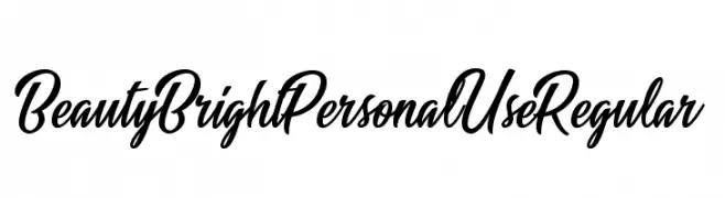
Scaricare 1130 Downloads@WebFont -
![Beauty Bright Personal Use Regular font caratteri gratis]() Scaricare 1130 Downloads@WebFont
Scaricare 1130 Downloads@WebFont -
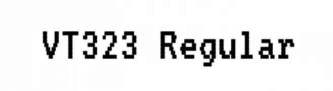
( Copyright 2011, The VT323 Project Authors (peter.hull@oikoi.com) )
A monospaced, pixelated font with a retro digital aesthetic.
![VT323 Regular font caratteri gratis]() Scaricare 1130 Downloads@WebFont
Scaricare 1130 Downloads@WebFont -
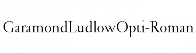
( Fonts by Castcraft Software - opti.netii.net - check the website before use )
A classic serif font with elegant, refined letterforms and subtle stroke contrast.
![GaramondLudlowOpti-Roman font caratteri gratis]() Scaricare 1130 Downloads@WebFont
Scaricare 1130 Downloads@WebFont -
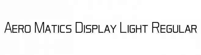
( Font by Jayvee D. Enaguas - grandchaos9000.deviantart.com )
A modern, geometric font with clean lines and excellent readability.
![Aero Matics Display Light Regular font caratteri gratis]() Scaricare 1130 Downloads@WebFont
Scaricare 1130 Downloads@WebFont -
( Copyright (c) 2011 by Sorkin Type Co (www.sorkintype.com) )
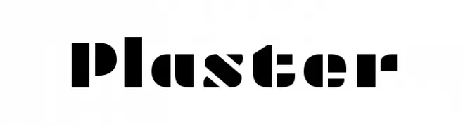
A bold, geometric font with a modern, industrial feel.
![Plaster font caratteri gratis]() Scaricare 1130 Downloads@WebFont
Scaricare 1130 Downloads@WebFont -
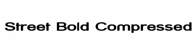
( Fonts by Apostrophic Lab )
A bold, compressed font with thick strokes and narrow letterforms.
![Street Bold Compressed font caratteri gratis]() Scaricare 1130 Downloads@WebFont
Scaricare 1130 Downloads@WebFont -
![Kenzou font caratteri gratis]() Scaricare 1130 Downloads@WebFont
Scaricare 1130 Downloads@WebFont -
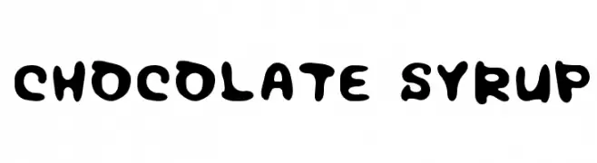
( Fonts by Colorful Typhoon - http://orange.s56.xrea.com/blog/ )
A playful, bold font with rounded, dripping characters.
![Chocolate syrup font caratteri gratis]() Scaricare 1130 Downloads@WebFont
Scaricare 1130 Downloads@WebFont -
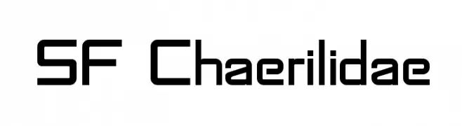
![SF Chaerilidae font caratteri gratis]() Scaricare 1130 Downloads@WebFont
Scaricare 1130 Downloads@WebFont -
( Fonts by Apostrophic Lab )
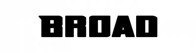
A bold, geometric font with strong, angular lines and a modern, industrial feel.
![Broad font caratteri gratis]() Scaricare 1130 Downloads@WebFont
Scaricare 1130 Downloads@WebFont -
![F.M.J. font caratteri gratis]() Scaricare 1130 Downloads@WebFont
Scaricare 1130 Downloads@WebFont -
( Fonts by Apostrophic Lab )
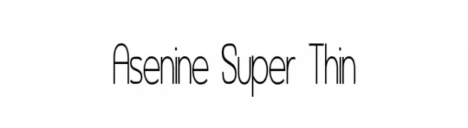
An ultra-thin, modern font with elongated, sleek characters.
![Asenine Super Thin font caratteri gratis]() Scaricare 1130 Downloads@WebFont
Scaricare 1130 Downloads@WebFont -
![Mufferaw font caratteri gratis]() Scaricare 1130 Downloads@WebFont
Scaricare 1130 Downloads@WebFont -
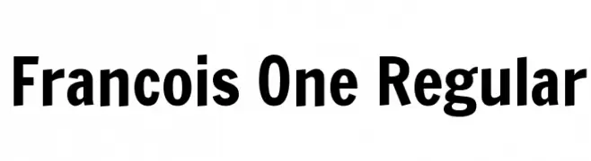
( Copyright 2011 The Francois One Project Authors (contact@sansoxygen.com) )
A bold, modern typeface with strong geometric shapes and clean lines.
![Francois One Regular font caratteri gratis]() Scaricare 1129 Downloads@WebFont
Scaricare 1129 Downloads@WebFont -
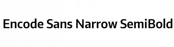
( Copyright (c) 2012, Impallari Type (www.impallari.com), with Reserved Font Name Encode Sans. )
A modern, narrow sans-serif font with semi-bold weight.
![Encode Sans Narrow SemiBold font caratteri gratis]() Scaricare 1129 Downloads@WebFont
Scaricare 1129 Downloads@WebFont -
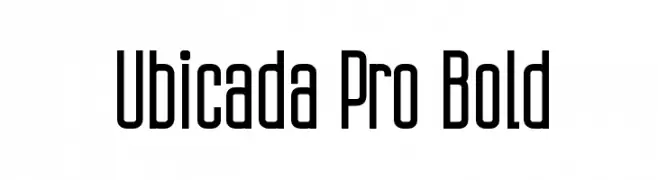
Caratteri di defharo. For commercial use please contact the owner.
![Ubicada Pro Bold font caratteri gratis]() Scaricare 1129 Downloads@WebFont
Scaricare 1129 Downloads@WebFont -
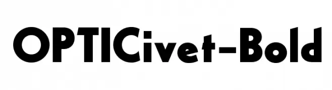
( Fonts by Castcraft Software - opti.netii.net - check the website before use )
A bold, geometric font with Art Deco influences and strong, angular lines.
![OPTICivet-Bold font caratteri gratis]() Scaricare 1129 Downloads@WebFont
Scaricare 1129 Downloads@WebFont -
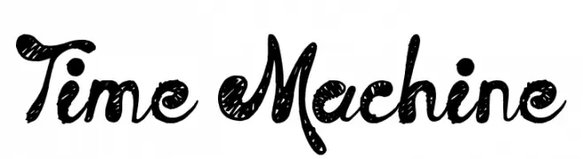
( Fonts by Jonathan Harris - www.tattoowoo.com )
A playful, hand-drawn font with a textured, whimsical style.
![Time Machine font caratteri gratis]() Scaricare 1129 Downloads@WebFont
Scaricare 1129 Downloads@WebFont -
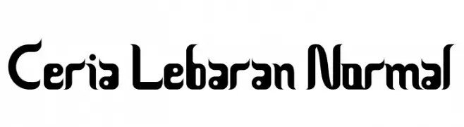
![Ceria Lebaran Normal font caratteri gratis]() Scaricare 1129 Downloads@WebFont
Scaricare 1129 Downloads@WebFont -
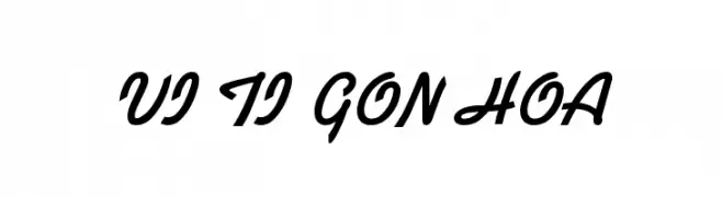
![VI Ti Gon Hoa font caratteri gratis]() Scaricare 1129 Downloads@WebFont
Scaricare 1129 Downloads@WebFont


Quali sono i font più popolari adesso?
Poppins, Roboto, Montserrat, Open Sans e Lato sono molto usati per le forme pulite e l'ampia applicabilità — dall'identità di marca alle landing page e ai poster.
Quali font si usano spesso nei loghi?
Le sans serif geometriche (es. Poppins, famiglie in stile Gotham) sono scelte comuni per un branding pulito e scalabile. Per un tocco personale restano valide script e stili manoscritti. Abbina un display deciso per i titoli a un corpo testo neutro per riconoscibilità ed equilibrio.
Ogni quanto si aggiorna la lista?
Con regolarità, in base ai download e all'attività reale. Torna spesso per scoprire in anticipo le nuove preferite.
💡 Consiglio: aggiungi ai preferiti — le tendenze cambiano in fretta e i font top di oggi possono ispirare il rebranding di domani.