Benvenuto nelle Font Più Popolari — dove popolarità e qualità si incontrano. Qui trovi i font più scaricati e usati dell'anno. Se cerchi scelte sicure per logo, web o social, inizia da qui.
Ogni font top si distingue per equilibrio, leggibilità e versatilità. Troverai sans serif moderne, script eleganti, serif vintage e display minimalisti.
-
( Annette Brown )
A playful, hand-drawn font with tall, narrow letters and a whimsical style.
 Scaricare 702 Downloads@WebFont
 -
( Fonts by Clement Nicolle - www.stereo-type.fr - Personal-use only. For commercial use please contact owner. )
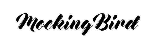
A bold, dynamic script font with high contrast and elegant flourishes.
![Mocking Bird font caratteri gratis]() Scaricare 702 Downloads@WebFont
Scaricare 702 Downloads@WebFont -
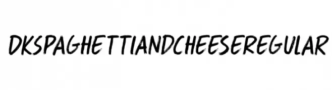
![DK Spaghetti And Cheese Regular font caratteri gratis]() Scaricare 702 Downloads@WebFont
Scaricare 702 Downloads@WebFont -
( Copyright (c) 2016, Ek Type. All rights reserved. )
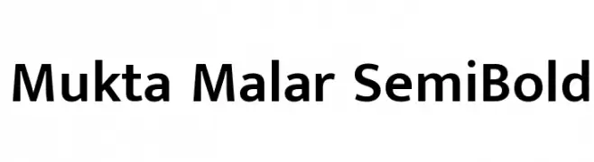
A modern, semi-bold sans-serif font with clean lines and balanced proportions.
![Mukta Malar SemiBold font caratteri gratis]() Scaricare 702 Downloads@WebFont
Scaricare 702 Downloads@WebFont -
( Fonts by Vigilante Typeface Corporation Larry Yerkes. Personal-use only. For commercial use please contact owner. )
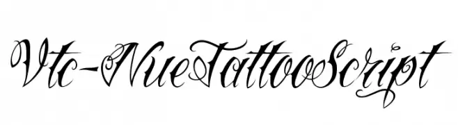
An ornate script font with flowing, interconnected letterforms and decorative flourishes.
![Vtc-NueTattooScript font caratteri gratis]() Scaricare 702 Downloads@WebFont
Scaricare 702 Downloads@WebFont -
-
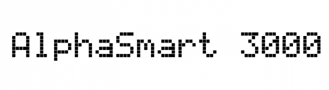
( Fonts by Colonel Sanders )
A pixelated, retro-style font with a blocky, geometric design.
![AlphaSmart 3000 font caratteri gratis]() Scaricare 702 Downloads@WebFont
Scaricare 702 Downloads@WebFont -
( Fonts by Jonathan S. Harris - www.tattoowoo.com. Personal-use only. For commercial use please contact owner. )
An elegant, intricate script font with flowing cursive letters and elaborate swashes.
![Everything Holiday font caratteri gratis]() Scaricare 702 Downloads@WebFont
Scaricare 702 Downloads@WebFont -
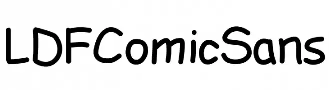
![LDFComicSans font caratteri gratis]() Scaricare 702 Downloads@WebFont
Scaricare 702 Downloads@WebFont -
( Fonts by Castcraft Software - opti.netii.net - check the website before use )
A bold serif font with elegant curves and strong vertical lines.
![OPTIEisen-Bold font caratteri gratis]() Scaricare 702 Downloads@WebFont
Scaricare 702 Downloads@WebFont -
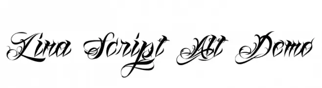
![Lina Script Alt Demo font caratteri gratis]() Scaricare 702 Downloads@WebFont
Scaricare 702 Downloads@WebFont -
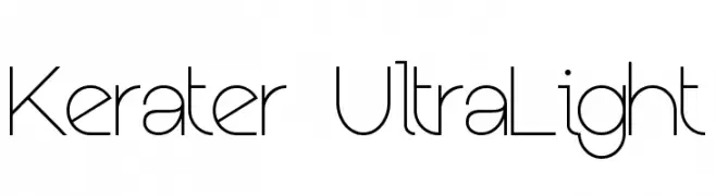
( Fonts by Mans Greback - www.mawns.com )
A modern, ultra-lightweight font with clean lines and a geometric structure.
![Kerater UltraLight font caratteri gratis]() Scaricare 702 Downloads@WebFont
Scaricare 702 Downloads@WebFont -
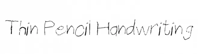
( Public domain / GNU GPL )
A thin, pencil-like handwriting font with a delicate, sketched appearance.
![Thin Pencil Handwriting font caratteri gratis]() Scaricare 702 Downloads@WebFont
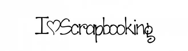
Scaricare 702 Downloads@WebFont -
![I*Scrapbooking font caratteri gratis]() Scaricare 702 Downloads@WebFont
Scaricare 702 Downloads@WebFont -
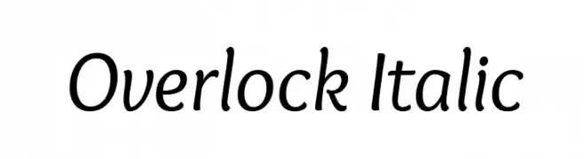
( Copyright (c) 2011, Dario Manuel Muhafara (http://www.tipo.net.ar) )
A playful, italicized font with smooth, rounded characters.
![Overlock Italic font caratteri gratis]() Scaricare 702 Downloads@WebFont
Scaricare 702 Downloads@WebFont -
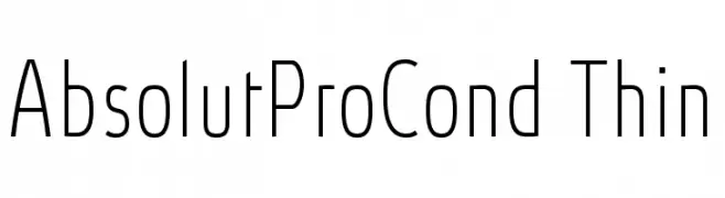
( Fonts by Ingo Zimmermann - www.ingofonts.com )
A sleek, modern, and condensed font with thin strokes and excellent legibility.
![AbsolutProCond-Thin font caratteri gratis]() Scaricare 702 Downloads@WebFont
Scaricare 702 Downloads@WebFont -
![Cyklop-Italic font caratteri gratis]() Scaricare 702 Downloads@WebFont
Scaricare 702 Downloads@WebFont -
( Fonts by Lauren Thompson - www.nymfont.com )
A sleek, modern italic font with clean lines and balanced proportions.
![Caviar Dreams Italic font caratteri gratis]() Scaricare 702 Downloads@WebFont
Scaricare 702 Downloads@WebFont -
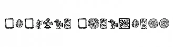
( Fonts by Klaus Johansen - www.listemageren.dK )
A collection of bold, intricate Mexican-inspired ornamental designs.
![Mexican Ornaments font caratteri gratis]() Scaricare 702 Downloads@WebFont
Scaricare 702 Downloads@WebFont -
( Fonts by Dieter Steffmann )
Ornate dingbat font with zodiac and seasonal illustrations.
![Jahreskreis font caratteri gratis]() Scaricare 702 Downloads@WebFont
Scaricare 702 Downloads@WebFont -
![water in my casio Regular font caratteri gratis]() Scaricare 702 Downloads@WebFont
Scaricare 702 Downloads@WebFont -
( Fonts by Apostrophic Lab )
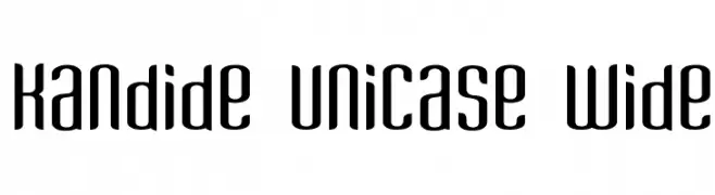
A modern, geometric unicase font with wide spacing and smooth, rounded strokes.
![Kandide Unicase Wide font caratteri gratis]() Scaricare 702 Downloads@WebFont
Scaricare 702 Downloads@WebFont -
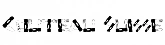
![Couteau Suisse font caratteri gratis]() Scaricare 702 Downloads@WebFont
Scaricare 702 Downloads@WebFont -
( Paul Lloyd Fonts )
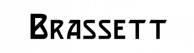
A bold, angular font with a modern, geometric style.
![Brassett font caratteri gratis]() Scaricare 702 Downloads
Scaricare 702 Downloads -
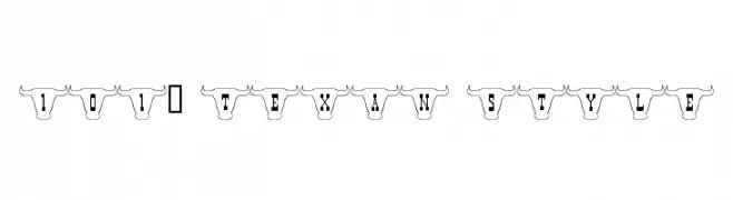
![101! Texan Style font caratteri gratis]() Scaricare 702 Downloads@WebFont
Scaricare 702 Downloads@WebFont -
( Fonts by Pizzadude )
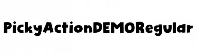
A playful, bold font with quirky, exaggerated shapes and a cartoonish style.
![Picky Action DEMO Regular font caratteri gratis]() Scaricare 701 Downloads@WebFont
Scaricare 701 Downloads@WebFont -
( Fonts by Modestype Studio )
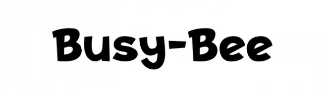
A playful, bold font with a hand-drawn, whimsical style.
![Busy-Bee font caratteri gratis]() Scaricare 701 Downloads@WebFont
Scaricare 701 Downloads@WebFont -
( Fonts by Typemade )
A geometric sans-serif font with a clean, modern aesthetic.
![Josefin Sans SemiBold font caratteri gratis]() Scaricare 701 Downloads@WebFont
Scaricare 701 Downloads@WebFont -
( Fonts by Union Sozialer Einrichtungen gGmbH )
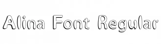
A playful, hand-drawn font with bold outlines and a whimsical style.
![Alina Font Regular font caratteri gratis]() Scaricare 701 Downloads@WebFont
Scaricare 701 Downloads@WebFont -
![Pages Grotesque Light Demo font caratteri gratis]() Scaricare 701 Downloads@WebFont
Scaricare 701 Downloads@WebFont -
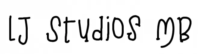
( LJ Design Studios - www.ljdesignstudios.com )
A playful, handwritten font with a whimsical and casual style.
![LJ Studios MB font caratteri gratis]() Scaricare 701 Downloads@WebFont
Scaricare 701 Downloads@WebFont -
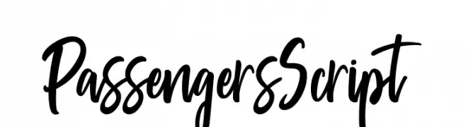
( Pathero Studio - www.patherostudio.com )
A bold, dynamic script font with flowing, interconnected strokes.
![PassengersScript font caratteri gratis]() Scaricare 701 Downloads@WebFont
Scaricare 701 Downloads@WebFont -
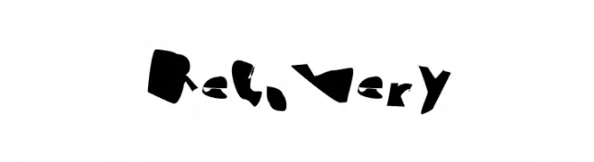
( Fonts by CannotIntoSpaceFonts - KineticPlasma Fonts - Personal-use only. For commercial use please contact owner. )
A bold, abstract font with fragmented, jagged characters.
![Recovery font caratteri gratis]() Scaricare 701 Downloads@WebFont
Scaricare 701 Downloads@WebFont -
( Fonts by madeDeduk )
A playful, handwritten font with fluid, dynamic letterforms and a whimsical style.
![Geovana font caratteri gratis]() Scaricare 701 Downloads@WebFont
Scaricare 701 Downloads@WebFont -
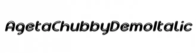
( Fonts by Studio Typo )
A playful, chubby italic font with a bold, rounded design.
![Ageta Chubby Demo Italic font caratteri gratis]() Scaricare 701 Downloads@WebFont
Scaricare 701 Downloads@WebFont -
( Fonts by Misti's Fonts )
A playful, rounded font with smooth curves and a friendly vibe.
![Strawberry Muffins Demo font caratteri gratis]() Scaricare 701 Downloads@WebFont
Scaricare 701 Downloads@WebFont


Quali sono i font più popolari adesso?
Poppins, Roboto, Montserrat, Open Sans e Lato sono molto usati per le forme pulite e l'ampia applicabilità — dall'identità di marca alle landing page e ai poster.
Quali font si usano spesso nei loghi?
Le sans serif geometriche (es. Poppins, famiglie in stile Gotham) sono scelte comuni per un branding pulito e scalabile. Per un tocco personale restano valide script e stili manoscritti. Abbina un display deciso per i titoli a un corpo testo neutro per riconoscibilità ed equilibrio.
Ogni quanto si aggiorna la lista?
Con regolarità, in base ai download e all'attività reale. Torna spesso per scoprire in anticipo le nuove preferite.
💡 Consiglio: aggiungi ai preferiti — le tendenze cambiano in fretta e i font top di oggi possono ispirare il rebranding di domani.