Benvenuto nelle Font Più Popolari — dove popolarità e qualità si incontrano. Qui trovi i font più scaricati e usati dell'anno. Se cerchi scelte sicure per logo, web o social, inizia da qui.
Ogni font top si distingue per equilibrio, leggibilità e versatilità. Troverai sans serif moderne, script eleganti, serif vintage e display minimalisti.
-
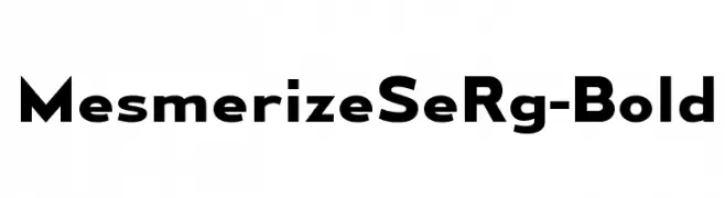
( Typodermic Fonts - Ray Larabie - www.typodermicfonts.com/ )
A bold, modern sans-serif font with geometric letterforms and consistent stroke widths.
 Scaricare 705 Downloads@WebFont
 -
( Just Font You - Ian Irwan Wismoyo - justfontyou.com/ )
An elegant script font with flowing, cursive letters and graceful swashes.
![Abundant Script DEMO Regular font caratteri gratis]() Scaricare 705 Downloads@WebFont
Scaricare 705 Downloads@WebFont -
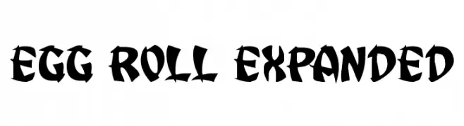
( Iconian Fonts - Daniel Zadorozny - www.iconian.com )
A bold, high-contrast decorative font with sharp edges and tight spacing.
![Egg Roll Expanded font caratteri gratis]() Scaricare 705 Downloads@WebFont
Scaricare 705 Downloads@WebFont -
![Wakanda font caratteri gratis]() Scaricare 705 Downloads@WebFont
Scaricare 705 Downloads@WebFont -
( Fonts by Kevin Richey - Personal-use only. For commercial use please contact owner. )
A sophisticated script font with flowing, cursive strokes and elegant flair.
![Otto font caratteri gratis]() Scaricare 705 Downloads@WebFont
Scaricare 705 Downloads@WebFont -
-
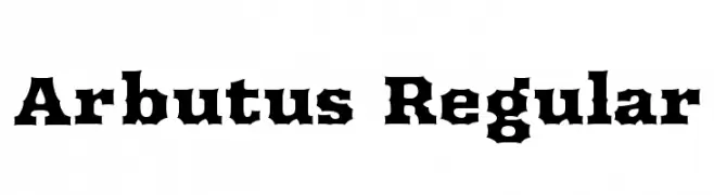
( Copyright (c) 2011 by Sorkin Type Co (www.sorkintype.com) )
A bold, angular font with a vintage Western flair.
![Arbutus Regular font caratteri gratis]() Scaricare 705 Downloads@WebFont
Scaricare 705 Downloads@WebFont -
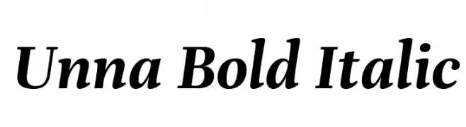
( Copyright 2016 The Unna Project Authors (omnibus.type@gmail.com) )
A bold, italic serif font with classic elegance and modern flair.
![Unna Bold Italic font caratteri gratis]() Scaricare 705 Downloads@WebFont
Scaricare 705 Downloads@WebFont -
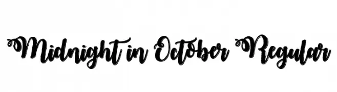
![Midnight in October Regular font caratteri gratis]() Scaricare 705 Downloads@WebFont
Scaricare 705 Downloads@WebFont -
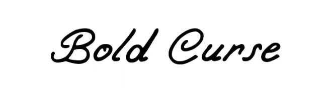
( Fonts by Jayde Garrow - GarrowGlitch - http://jaydegarrow.wix.com/jaydefonts. Personal-use only. For commercial use please contact owner. )
A bold, cursive font with flowing, connected letterforms and a sophisticated style.
![Bold Curse font caratteri gratis]() Scaricare 705 Downloads@WebFont
Scaricare 705 Downloads@WebFont -
( Fonts by www.fontpanda.com. Personal-use only. For commercial use please contact owner. )
A casual, handwritten font with uneven, dynamic strokes.
![Chicken Scratch font caratteri gratis]() Scaricare 705 Downloads@WebFont
Scaricare 705 Downloads@WebFont -
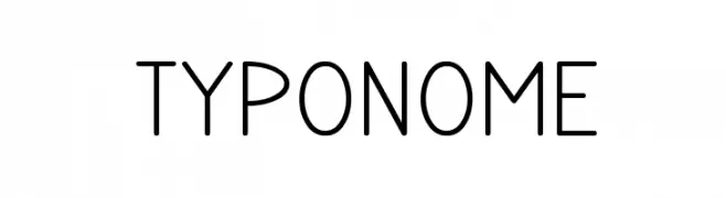
![TYPONOME font caratteri gratis]() Scaricare 705 Downloads@WebFont
Scaricare 705 Downloads@WebFont -
( Fonts by Castcraft Software - opti.netii.net - check the website before use )
An elegant serif font with high contrast and decorative flourishes.
![OPTIAmadeus-Open font caratteri gratis]() Scaricare 705 Downloads@WebFont
Scaricare 705 Downloads@WebFont -
( Fonts by Castcraft Software - opti.netii.net - check the website before use )
A modern, clean typeface with balanced structure and excellent readability.
![OPTIDelTon-Light font caratteri gratis]() Scaricare 705 Downloads@WebFont
Scaricare 705 Downloads@WebFont -
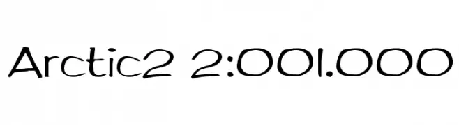
( Fonts by Sam Wang )
A playful, hand-drawn style font with rounded, flowing characters.
![Arctic2 2:001.000 font caratteri gratis]() Scaricare 705 Downloads@WebFont
Scaricare 705 Downloads@WebFont -
( Fonts by Arkandis Digital Foundry )
A modern, condensed sans-serif font with a clean and professional look.
![GilliusADF-Cond font caratteri gratis]() Scaricare 705 Downloads@WebFont
Scaricare 705 Downloads@WebFont -
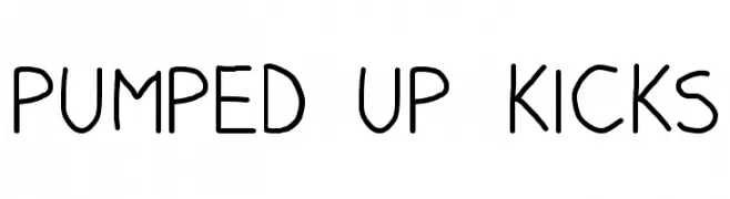
![Pumped Up Kicks font caratteri gratis]() Scaricare 705 Downloads@WebFont
Scaricare 705 Downloads@WebFont -
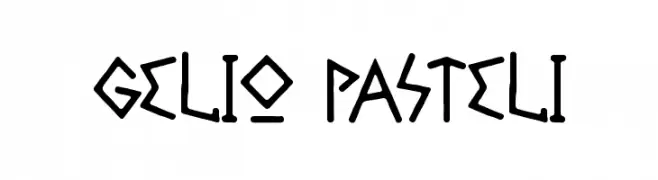
( Fonts by Cumberland Fontworks - http://www222.pair.com/sjohn/fonts.htm - S. John Ross )
A playful, hand-drawn font with bold, angular characters.
![Gelio Pasteli font caratteri gratis]() Scaricare 705 Downloads@WebFont
Scaricare 705 Downloads@WebFont -
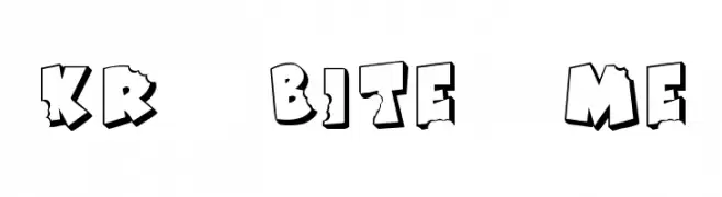
( Fonts by Kat`s Fun Fonts - Personal-use only. For commercial use please contact owner. )
A playful, bold font with a bitten, chipped design ideal for comic-style projects.
![KR Bite Me font caratteri gratis]() Scaricare 705 Downloads@WebFont
Scaricare 705 Downloads@WebFont -
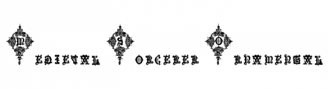
![Medieval Sorcerer Ornamental font caratteri gratis]() Scaricare 705 Downloads@WebFont
Scaricare 705 Downloads@WebFont -
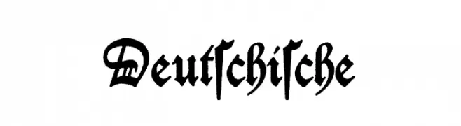
( Fonts by Bumbayo Font Fabrik - bumbayo.blogspot.com )
A traditional Blackletter font with ornate, angular designs and historical elegance.
![Deutschische font caratteri gratis]() Scaricare 705 Downloads@WebFont
Scaricare 705 Downloads@WebFont -
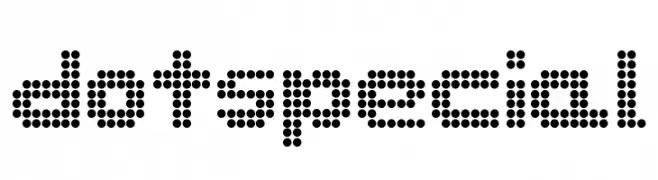
![dotspecial font caratteri gratis]() Scaricare 705 Downloads@WebFont
Scaricare 705 Downloads@WebFont -
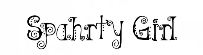
( Fonts by Omega Font Labs )
A whimsical and decorative font with playful swirls and dots.
![Spahrty Girl font caratteri gratis]() Scaricare 705 Downloads@WebFont
Scaricare 705 Downloads@WebFont -
![SansLogique font caratteri gratis]() Scaricare 705 Downloads@WebFont
Scaricare 705 Downloads@WebFont -
![Ionic Charge font caratteri gratis]() Scaricare 705 Downloads@WebFont
Scaricare 705 Downloads@WebFont -
( Fonts by ShyFonts )
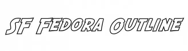
A bold, outlined font with a dynamic and impactful style.
![SF Fedora Outline font caratteri gratis]() Scaricare 705 Downloads@WebFont
Scaricare 705 Downloads@WebFont -
( Fonts by ShyFonts )
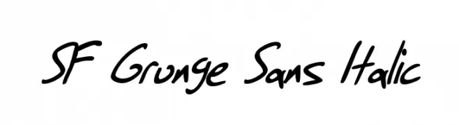
A casual, handwritten-style font with a dynamic, slanted appearance.
![SF Grunge Sans Italic font caratteri gratis]() Scaricare 705 Downloads@WebFont
Scaricare 705 Downloads@WebFont -
![Butterfly Letters font caratteri gratis]() Scaricare 705 Downloads@WebFont
Scaricare 705 Downloads@WebFont -
( Fonts by Nick Curtis - www.nicksfonts.com )
A tall, narrow font with a modern and elegant design.
![NamesakeNF font caratteri gratis]() Scaricare 705 Downloads@WebFont
Scaricare 705 Downloads@WebFont -
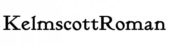
( Fonts by Nick Curtis - www.nicksfonts.com )
A classic serif font with elegant and refined characters.
![KelmscottRoman font caratteri gratis]() Scaricare 705 Downloads@WebFont
Scaricare 705 Downloads@WebFont -
( Fonts by BLKBK Fonts - www.blkbk.shop - Personal-use only. For commercial use please contact owner. Commerciali Caratteri )
A bold, dynamic brush script font with lively, expressive strokes.
![Game Time font caratteri gratis]() Scaricare 704 Downloads
Scaricare 704 Downloads -
( Fonts by Letterayu )
![Botana font caratteri gratis]() Scaricare 704 Downloads@WebFont
Scaricare 704 Downloads@WebFont -
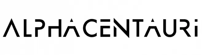
( Fonts by JoannaVu - https://ioannaladopoulou.design - Personal-use only. For commercial use please contact owner. )
A modern, geometric font with bold, angular letterforms and a futuristic aesthetic.
![AlphaCentauri font caratteri gratis]() Scaricare 704 Downloads@WebFont
Scaricare 704 Downloads@WebFont -
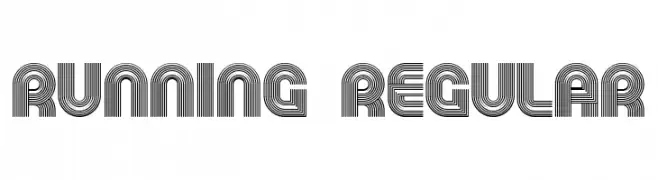
( Fonts by Vladimir Nikolic - https://www.creativefabrica.com/product/educated-deers/ref/144265/ - Personal-use only. For commercial use please contact owner. )
A decorative font with multi-line, geometric characters for a bold, modern look.
![Running Regular font caratteri gratis]() Scaricare 704 Downloads@WebFont
Scaricare 704 Downloads@WebFont -
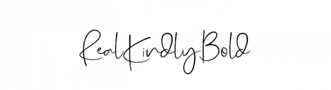
( dharmas - Jamaludin Ahmad - creativemarket.com/dharmas?u=dharmas )
A playful, handwritten font with elongated strokes and medium contrast.
![RealKindly-Bold font caratteri gratis]() Scaricare 704 Downloads@WebFont
Scaricare 704 Downloads@WebFont -
( Mister Heavy Face )
A bold, distressed stencil font with an industrial, vintage feel.
![Fliped font caratteri gratis]() Scaricare 704 Downloads@WebFont
Scaricare 704 Downloads@WebFont


Quali sono i font più popolari adesso?
Poppins, Roboto, Montserrat, Open Sans e Lato sono molto usati per le forme pulite e l'ampia applicabilità — dall'identità di marca alle landing page e ai poster.
Quali font si usano spesso nei loghi?
Le sans serif geometriche (es. Poppins, famiglie in stile Gotham) sono scelte comuni per un branding pulito e scalabile. Per un tocco personale restano valide script e stili manoscritti. Abbina un display deciso per i titoli a un corpo testo neutro per riconoscibilità ed equilibrio.
Ogni quanto si aggiorna la lista?
Con regolarità, in base ai download e all'attività reale. Torna spesso per scoprire in anticipo le nuove preferite.
💡 Consiglio: aggiungi ai preferiti — le tendenze cambiano in fretta e i font top di oggi possono ispirare il rebranding di domani.