Benvenuto nelle Font Più Popolari — dove popolarità e qualità si incontrano. Qui trovi i font più scaricati e usati dell'anno. Se cerchi scelte sicure per logo, web o social, inizia da qui.
Ogni font top si distingue per equilibrio, leggibilità e versatilità. Troverai sans serif moderne, script eleganti, serif vintage e display minimalisti.
-
 Scaricare 6563 Downloads@WebFont
 -
( Fonts by Mans Greback - www.mawns.com )
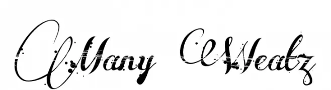
An ornate, calligraphic font with intricate swirls and flourishes.
![Many Weatz font caratteri gratis]() Scaricare 6562 Downloads@WebFont
Scaricare 6562 Downloads@WebFont -
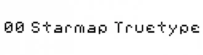
![00 Starmap Truetype font caratteri gratis]() Scaricare 6562 Downloads
Scaricare 6562 Downloads -
( Fonts by Hanken Design Co. - Personal-use only. For commercial use please contact owner. )
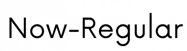
A modern, geometric sans-serif font with balanced proportions and high legibility.
![Now-Regular font caratteri gratis]() Scaricare 6559 Downloads@WebFont
Scaricare 6559 Downloads@WebFont -
( Fonts by Mirela Belova - www.fontfabric.com - Personal-use only. For commercial use please contact owner. )
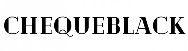
A bold serif typeface with strong, authoritative strokes and sharp serifs.
![Cheque Black font caratteri gratis]() Scaricare 6557 Downloads@WebFont
Scaricare 6557 Downloads@WebFont -
![NHL Toronto Alternate font caratteri gratis]() Scaricare 6552 Downloads@WebFont
Scaricare 6552 Downloads@WebFont -
( Fonts by a www.fontfabric.com. Personal-use only. For commercial use please contact owner. )
A modern, thin sans-serif font with a clean and minimalist design.
![Muller Thin DEMO font caratteri gratis]() Scaricare 6551 Downloads@WebFont
Scaricare 6551 Downloads@WebFont -
![Banana Regular font caratteri gratis]() Scaricare 6548 Downloads@WebFont
Scaricare 6548 Downloads@WebFont -
( Copyright 2015 Google Inc. All Rights Reserved. )
A bold, handwritten-style font with a casual and friendly appearance.
![Caveat Bold font caratteri gratis]() Scaricare 6547 Downloads@WebFont
Scaricare 6547 Downloads@WebFont -
( Fonts by Matthew Austin Petty - www.disturbed.com )
A bold serif font with a classic yet modern aesthetic.
![Tangerine font caratteri gratis]() Scaricare 6547 Downloads@WebFont
Scaricare 6547 Downloads@WebFont -
![C rial font caratteri gratis]() Scaricare 6546 Downloads@WebFont
Scaricare 6546 Downloads@WebFont -
( Copyright (c) 2012 Natanael Gama (info@ndiscovered.com), with Reserved Font Name 'Cinzel' )
A bold, high-contrast serif font with a classic and elegant style.
![Cinzel Black font caratteri gratis]() Scaricare 6544 Downloads@WebFont
Scaricare 6544 Downloads@WebFont -
( Fonts by Alphabet & Type: Typography & Graphic - Paolo Vannucci - www.alphabetype.it )
A bold slab serif font with a classic Western style.
![*Lucky Luke* font caratteri gratis]() Scaricare 6544 Downloads@WebFont
Scaricare 6544 Downloads@WebFont -
( Fonts by www.typedepot.com )
A bold, condensed serif font with a modern and elegant style.
![Corki font caratteri gratis]() Scaricare 6543 Downloads@WebFont
Scaricare 6543 Downloads@WebFont -
Caratteri di JuanCasco. For commercial use please contact the owner.
( Fonts by Juan Casco - www.juancasco.net )
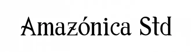
A classic serif font with elegant, pronounced serifs and a timeless appearance.
![Amazónica Std font caratteri gratis]() Scaricare 6539 Downloads@WebFont
Scaricare 6539 Downloads@WebFont -
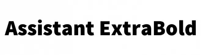
( Copyright 2010 The Assistant Project Authors, with Reserved Font Name 'Source'. Source is a trademark of Adobe Systems Incorporated in the United States and/or other countries. )
A bold, geometric font ideal for impactful headlines.
![Assistant ExtraBold font caratteri gratis]() Scaricare 6537 Downloads@WebFont
Scaricare 6537 Downloads@WebFont -
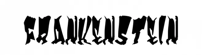
( Fonts by Marty Bee - www.martybee.com )
A bold, jagged font with a classic horror theme and hand-drawn appearance.
![Frankenstein font caratteri gratis]() Scaricare 6534 Downloads@WebFont
Scaricare 6534 Downloads@WebFont -
![NCAA Missouri Tigers Bold font caratteri gratis]() Scaricare 6530 Downloads@WebFont
Scaricare 6530 Downloads@WebFont -
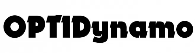
( Fonts by Castcraft Software - opti.netii.net - check the website before use )
A bold, impactful font with thick strokes and a strong presence.
![OPTIDynamo font caratteri gratis]() Scaricare 6530 Downloads@WebFont
Scaricare 6530 Downloads@WebFont -
Caratteri di HammerBro101. For commercial use please contact the owner.
![MARIOFontv3-SolidRemake font caratteri gratis]() Scaricare 6528 Downloads@WebFont
Scaricare 6528 Downloads@WebFont -
( Copyright (c) 2014, Girish Dalvi, Ek Type. All rights reserved. )
A bold, modern sans-serif font with clean lines and strong readability.
![Ek Mukta Bold font caratteri gratis]() Scaricare 6526 Downloads@WebFont
Scaricare 6526 Downloads@WebFont -
![Arenski Regular font caratteri gratis]() Scaricare 6526 Downloads@WebFont
Scaricare 6526 Downloads@WebFont -
( Copyright (c) 2014, Indian Type Foundry (info@indiantypefoundry.com). )
A bold, modern sans-serif font with clean lines and excellent readability.
![Hind Bold font caratteri gratis]() Scaricare 6517 Downloads@WebFont
Scaricare 6517 Downloads@WebFont -
( Fonts by Hanoded )
A playful, handwritten font with a whimsical and friendly style.
![DKTheCatsWhiskers font caratteri gratis]() Scaricare 6515 Downloads@WebFont
Scaricare 6515 Downloads@WebFont -
( Fonts by Adien Gunarta - fontasticindonesia.blogspot.com )
A modern, geometric font with rounded edges and consistent strokes.
![Madura Regular font caratteri gratis]() Scaricare 6513 Downloads@WebFont
Scaricare 6513 Downloads@WebFont -
( Fonts by Castcraft Software - opti.netii.net - check the website before use )
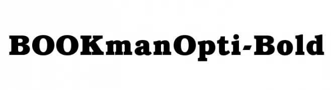
Bold serif font with strong, classic characters.
![BOOKmanOpti-Bold font caratteri gratis]() Scaricare 6510 Downloads@WebFont
Scaricare 6510 Downloads@WebFont -
( Copyright 2011 The Montserrat Project Authors (https://github.com/JulietaUla/Montserrat) )
A modern, geometric sans-serif font with a clean and versatile style.
![Montserrat Alternates SemiBold font caratteri gratis]() Scaricare 6509 Downloads@WebFont
Scaricare 6509 Downloads@WebFont -
( Fonts by Boba Fonts )
A bold, futuristic font with sharp angles and a sci-fi aesthetic.
![Star Jedi font caratteri gratis]() Scaricare 6509 Downloads@WebFont
Scaricare 6509 Downloads@WebFont -
( Copyright (c) 2009, 2010, 2011 Daniel Johnson (
A clean, modern sans-serif font with uniform stroke width and geometric structure.
![Didact Gothic font caratteri gratis]() Scaricare 6508 Downloads@WebFont
Scaricare 6508 Downloads@WebFont -
( Fonts by softerviews.org )
A bold, gothic-inspired font with sharp, angular strokes and a dramatic presence.
![Odana font caratteri gratis]() Scaricare 6501 Downloads@WebFont
Scaricare 6501 Downloads@WebFont -
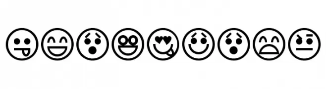
![Emoticons font caratteri gratis]() Scaricare 6499 Downloads@WebFont
Scaricare 6499 Downloads@WebFont -
![Distant Galaxy Solid font caratteri gratis]() Scaricare 6499 Downloads@WebFont
Scaricare 6499 Downloads@WebFont -
( Fonts by Francis John - Francis Studio - Personal-use only. For commercial use please contact owner. )
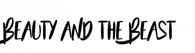
A bold, handwritten font with a playful and energetic style.
![Beauty and the Beast font caratteri gratis]() Scaricare 6495 Downloads@WebFont
Scaricare 6495 Downloads@WebFont -
( Fonts by Castcraft Software - opti.netii.net - check the website before use )
An elegant and decorative font with artistic flourishes and smooth curves.
![HermosaOpti font caratteri gratis]() Scaricare 6494 Downloads@WebFont
Scaricare 6494 Downloads@WebFont -
( Fonts by Yorlmar Campos - www.ycampos.com )
A bold, geometric font with strong, angular shapes and solid fills.
![RNS Bobo Dylan font caratteri gratis]() Scaricare 6494 Downloads@WebFont
Scaricare 6494 Downloads@WebFont


Quali sono i font più popolari adesso?
Poppins, Roboto, Montserrat, Open Sans e Lato sono molto usati per le forme pulite e l'ampia applicabilità — dall'identità di marca alle landing page e ai poster.
Quali font si usano spesso nei loghi?
Le sans serif geometriche (es. Poppins, famiglie in stile Gotham) sono scelte comuni per un branding pulito e scalabile. Per un tocco personale restano valide script e stili manoscritti. Abbina un display deciso per i titoli a un corpo testo neutro per riconoscibilità ed equilibrio.
Ogni quanto si aggiorna la lista?
Con regolarità, in base ai download e all'attività reale. Torna spesso per scoprire in anticipo le nuove preferite.
💡 Consiglio: aggiungi ai preferiti — le tendenze cambiano in fretta e i font top di oggi possono ispirare il rebranding di domani.