Benvenuto nelle Font Più Popolari — dove popolarità e qualità si incontrano. Qui trovi i font più scaricati e usati dell'anno. Se cerchi scelte sicure per logo, web o social, inizia da qui.
Ogni font top si distingue per equilibrio, leggibilità e versatilità. Troverai sans serif moderne, script eleganti, serif vintage e display minimalisti.
-
( Fonts by Castcraft Software - OPTI Fonts Archive - opti.netii.net - Personal-use only. For commercial use please contact owner. )
A bold, rounded font with a playful and friendly style.
 Scaricare 6305 Downloads@WebFont
 -
( Vladimir Nikolic - www.coroflot.com/vladimirnikolic )
A bold, decorative typeface with geometric shapes and a theatrical style.
![Broadway Flat Regular font caratteri gratis]() Scaricare 6304 Downloads@WebFont
Scaricare 6304 Downloads@WebFont -
( Fonts by paperstreet )
A modern, clean sans-serif font with rounded edges and uniform strokes.
![Congratulations DEMO font caratteri gratis]() Scaricare 6304 Downloads@WebFont
Scaricare 6304 Downloads@WebFont -
Caratteri di HammerBro101. For commercial use please contact the owner.
![MARIOFontv3-SolidRemake font caratteri gratis]() Scaricare 6300 Downloads@WebFont
Scaricare 6300 Downloads@WebFont -
( Fonts by Castcraft Software - OPTI Fonts Archive - opti.netii.net - Personal-use only. For commercial use please contact owner. )
A bold, semi-bold font with strong, well-defined characters and slight stroke contrast.
![OPTIOptionSemiBold font caratteri gratis]() Scaricare 6300 Downloads@WebFont
Scaricare 6300 Downloads@WebFont -
-
( Fonts by Mickey Rossi - www.subflux.com )
A bold, geometric sans-serif font with a modern, industrial style.
![BarBender Bold font caratteri gratis]() Scaricare 6300 Downloads@WebFont
Scaricare 6300 Downloads@WebFont -
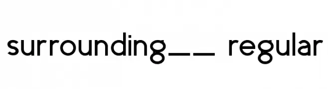
![surrounding__ regular font caratteri gratis]() Scaricare 6298 Downloads@WebFont
Scaricare 6298 Downloads@WebFont -
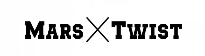
( Fonts by Ariq Sya - marsnev.com )
A bold slab serif font with a vintage, industrial feel.
![Mars&Twist font caratteri gratis]() Scaricare 6297 Downloads@WebFont
Scaricare 6297 Downloads@WebFont -
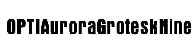
( Fonts by Castcraft Software - opti.netii.net - check the website before use )
A bold, modern font with strong, uniform strokes for impactful design.
![OPTIAuroraGroteskNine font caratteri gratis]() Scaricare 6295 Downloads@WebFont
Scaricare 6295 Downloads@WebFont -
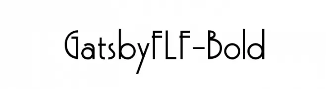
( Fonts by Casady & Greene )
A bold, Art Deco-inspired font with geometric shapes and clean lines.
![GatsbyFLF-Bold font caratteri gratis]() Scaricare 6295 Downloads@WebFont
Scaricare 6295 Downloads@WebFont -
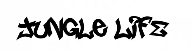
( Fonts by or from www.graffitifonts.net )
A bold, graffiti-inspired font with sharp angles and dynamic movement.
![Jungle LIFE font caratteri gratis]() Scaricare 6294 Downloads@WebFont
Scaricare 6294 Downloads@WebFont -
![NBA Pistons font caratteri gratis]() Scaricare 6290 Downloads@WebFont
Scaricare 6290 Downloads@WebFont -
![HeadlineNEWS font caratteri gratis]() Scaricare 6290 Downloads@WebFont
Scaricare 6290 Downloads@WebFont -
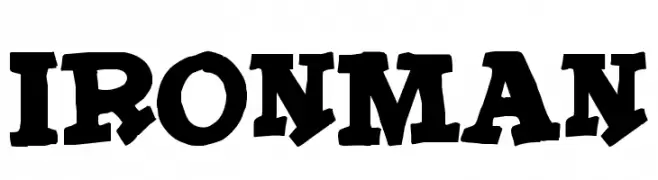
( Fonts by Jacob Fisher - www.pizzadude.dk )
A bold, playful font with exaggerated serifs and dynamic curves.
![IronMan font caratteri gratis]() Scaricare 6288 Downloads@WebFont
Scaricare 6288 Downloads@WebFont -
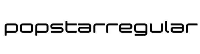
( These fonts are free to use in any private, recreational manner.For commercial go to www.flopdesign.com/fordesign/font.html )
A modern, geometric font with a sleek and futuristic style.
![popstarregular font caratteri gratis]() Scaricare 6285 Downloads@WebFont
Scaricare 6285 Downloads@WebFont -
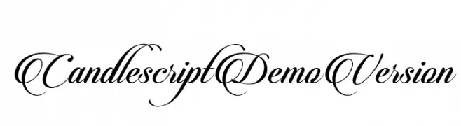
![CandlescriptDemoVersion font caratteri gratis]() Scaricare 6277 Downloads@WebFont
Scaricare 6277 Downloads@WebFont -
( Fonts by Darcy Baldwin {fontography} )
A digital, segmented font with a modern, tech-inspired style.
![DJB Get Digital font caratteri gratis]() Scaricare 6277 Downloads@WebFont
Scaricare 6277 Downloads@WebFont -
![Telefonica Regular font caratteri gratis]() Scaricare 6276 Downloads@WebFont
Scaricare 6276 Downloads@WebFont -
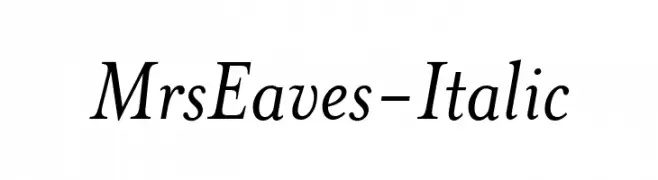
![MrsEaves-Italic font caratteri gratis]() Scaricare 6274 Downloads
Scaricare 6274 Downloads -
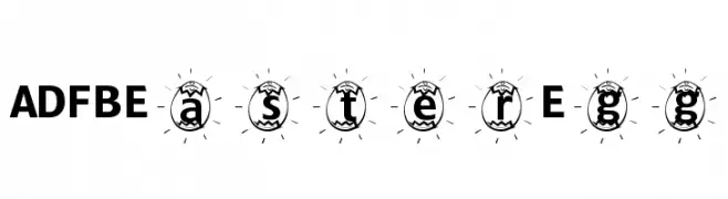
![ADFBEasterEgg font caratteri gratis]() Scaricare 6274 Downloads@WebFont
Scaricare 6274 Downloads@WebFont -
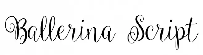
( Fonts by a Emily Spadoni - http://creativemarket.com/emilyspadoni/. Personal-use only. For commercial use please contact owner. )
A graceful script font with elegant swirls and loops, perfect for sophisticated designs.
![Ballerina Script font caratteri gratis]() Scaricare 6271 Downloads@WebFont
Scaricare 6271 Downloads@WebFont -
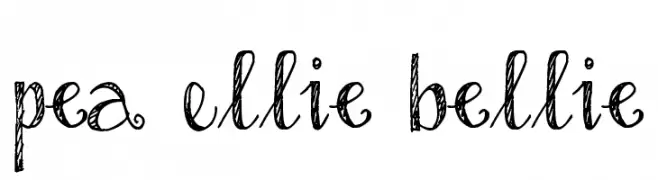
![Pea Ellie Bellie font caratteri gratis]() Scaricare 6270 Downloads@WebFont
Scaricare 6270 Downloads@WebFont -
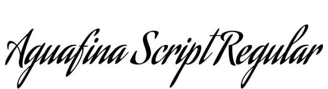
( Copyright (c) 2011 Angel Koziupa (sudtipos@sudtipos.com) )
An elegant and flowing script font with bold, cursive letterforms.
![Aguafina Script Regular font caratteri gratis]() Scaricare 6269 Downloads@WebFont
Scaricare 6269 Downloads@WebFont -
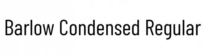
( Copyright 2017 The Barlow Project Authors (https://github.com/jpt/barlow) )
A modern, condensed sans-serif font with uniform stroke width and excellent readability.
![Barlow Condensed Regular font caratteri gratis]() Scaricare 6266 Downloads@WebFont
Scaricare 6266 Downloads@WebFont -
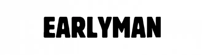
( Fonts by Fran Fernandez - Personal-use only. For commercial use please contact owner. )
A bold, rounded font with a strong, impactful presence.
![Early Man font caratteri gratis]() Scaricare 6265 Downloads@WebFont
Scaricare 6265 Downloads@WebFont -
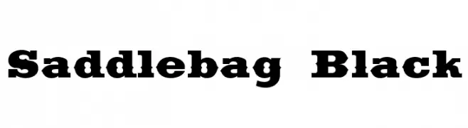
( Fonts by Dieter Steffmann )
A bold, vintage-style serif font with strong, block-like serifs.
![Saddlebag Black font caratteri gratis]() Scaricare 6265 Downloads@WebFont
Scaricare 6265 Downloads@WebFont -
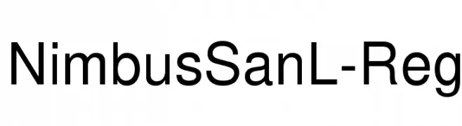
( Fonts by URW++ - Personal-use only. For commercial use please contact owner. )
A modern sans-serif font with clean, balanced letterforms and excellent readability.
![NimbusSanL-Reg font caratteri gratis]() Scaricare 6264 Downloads@WebFont
Scaricare 6264 Downloads@WebFont -
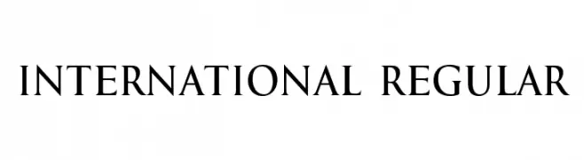
( Fonts by vladimirnikolic - Personal-use only. For commercial use please contact owner. )
A classic serif font with elegant curves and medium contrast, ideal for formal and traditional designs.
![International Regular font caratteri gratis]() Scaricare 6263 Downloads@WebFont
Scaricare 6263 Downloads@WebFont -
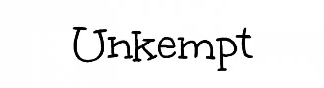
( Google Web Fonts )
A playful, hand-drawn font with irregular, whimsical letterforms.
![Unkempt font caratteri gratis]() Scaricare 6262 Downloads@WebFont
Scaricare 6262 Downloads@WebFont -
( Fonts by Castcraft Software - opti.netii.net - check the website before use )
A bold, geometric font with thick strokes and strong visual impact.
![OPTIKabel-Heavy font caratteri gratis]() Scaricare 6260 Downloads@WebFont
Scaricare 6260 Downloads@WebFont -
( Fonts by Tyler Finck. Personal-use only. For commercial use please contact owner. )
A bold, modern sans-serif font with a geometric and uniform structure.
![OstrichSans-Heavy font caratteri gratis]() Scaricare 6257 Downloads@WebFont
Scaricare 6257 Downloads@WebFont -
( Fonts by Televo - Personal-use only. For commercial use please contact owner. )
A bold, geometric font with a futuristic, digital aesthetic.
![KHData Regular font caratteri gratis]() Scaricare 6256 Downloads@WebFont
Scaricare 6256 Downloads@WebFont -
( Fonts by paperstreet )
A bold, geometric font with a strong, industrial feel.
![Millionaire DEMO font caratteri gratis]() Scaricare 6253 Downloads@WebFont
Scaricare 6253 Downloads@WebFont -
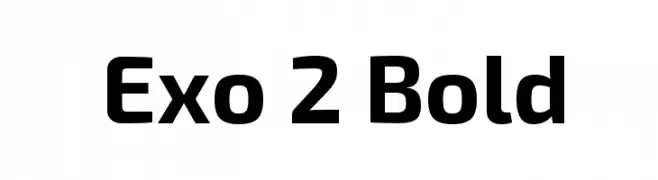
( Copyright (c) 2013, Natanael Gama (www.ndiscovered.com . info(at)ndiscovered.com), with Reserved Font Name 'Exo' )
A modern, bold font with a geometric and sleek design.
![Exo 2 Bold font caratteri gratis]() Scaricare 6253 Downloads@WebFont
Scaricare 6253 Downloads@WebFont -
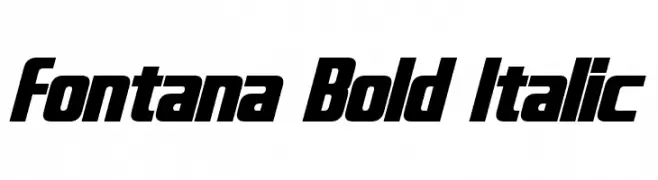
( Fonts by a Neale Davidson - www.pixelsagas.com. Personal-use only. For commercial use please contact owner. )
A bold, italicized font with a modern and dynamic style.
![Fontana Bold Italic font caratteri gratis]() Scaricare 6253 Downloads@WebFont
Scaricare 6253 Downloads@WebFont


Quali sono i font più popolari adesso?
Poppins, Roboto, Montserrat, Open Sans e Lato sono molto usati per le forme pulite e l'ampia applicabilità — dall'identità di marca alle landing page e ai poster.
Quali font si usano spesso nei loghi?
Le sans serif geometriche (es. Poppins, famiglie in stile Gotham) sono scelte comuni per un branding pulito e scalabile. Per un tocco personale restano valide script e stili manoscritti. Abbina un display deciso per i titoli a un corpo testo neutro per riconoscibilità ed equilibrio.
Ogni quanto si aggiorna la lista?
Con regolarità, in base ai download e all'attività reale. Torna spesso per scoprire in anticipo le nuove preferite.
💡 Consiglio: aggiungi ai preferiti — le tendenze cambiano in fretta e i font top di oggi possono ispirare il rebranding di domani.