Benvenuto nelle Font Più Popolari — dove popolarità e qualità si incontrano. Qui trovi i font più scaricati e usati dell'anno. Se cerchi scelte sicure per logo, web o social, inizia da qui.
Ogni font top si distingue per equilibrio, leggibilità e versatilità. Troverai sans serif moderne, script eleganti, serif vintage e display minimalisti.
-
( Fonts by a www.fontfabric.com. Personal-use only. For commercial use please contact owner. )
A modern, rounded sans-serif font with medium weight and excellent readability.
 Scaricare 6436 Downloads@WebFont
 -
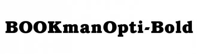
( Fonts by Castcraft Software - opti.netii.net - check the website before use )
Bold serif font with strong, classic characters.
![BOOKmanOpti-Bold font caratteri gratis]() Scaricare 6432 Downloads@WebFont
Scaricare 6432 Downloads@WebFont -
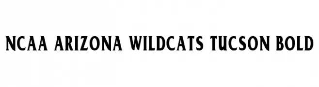
![NCAA Arizona Wildcats Tucson Bold font caratteri gratis]() Scaricare 6426 Downloads@WebFont
Scaricare 6426 Downloads@WebFont -
( Fonts by HPLHS Prop Fonts - Andrew H. Leman http://www.cthulhulives.org/toybox/propdocs/propfonts.html )
A bold, impactful typeface with thick, uniform strokes ideal for headlines.
![Headline One HPLHS font caratteri gratis]() Scaricare 6423 Downloads@WebFont
Scaricare 6423 Downloads@WebFont -
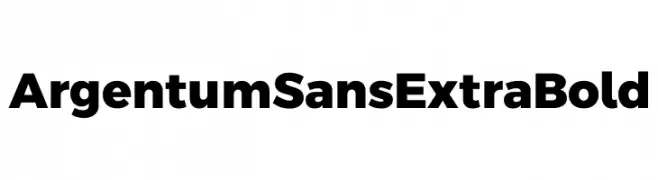
( Fonts by Cristiano Sobral - Personal-use only. For commercial use please contact owner. )
A bold, modern sans-serif font with thick strokes and strong presence.
![Argentum Sans ExtraBold font caratteri gratis]() Scaricare 6420 Downloads@WebFont
Scaricare 6420 Downloads@WebFont -
-
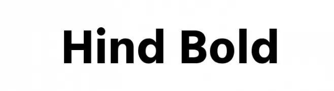
( Copyright (c) 2014, Indian Type Foundry (info@indiantypefoundry.com). )
A bold, modern sans-serif font with clean lines and excellent readability.
![Hind Bold font caratteri gratis]() Scaricare 6420 Downloads@WebFont
Scaricare 6420 Downloads@WebFont -
( Fonts by Castcraft Software - opti.netii.net - check the website before use )
An elegant and decorative font with artistic flourishes and smooth curves.
![HermosaOpti font caratteri gratis]() Scaricare 6420 Downloads@WebFont
Scaricare 6420 Downloads@WebFont -
( Copyright (c) 2011 by LatinoType Limitada (luciano@latinotype.com) )
A playful and whimsical script font with rounded, flowing characters.
![Sofia font caratteri gratis]() Scaricare 6420 Downloads@WebFont
Scaricare 6420 Downloads@WebFont -
( Fonts by Almaz Studio )
A playful, rounded font with bold, smooth curves and consistent spacing.
![Adia_Demo font caratteri gratis]() Scaricare 6419 Downloads@WebFont
Scaricare 6419 Downloads@WebFont -
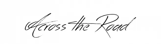
( www.tattoowoo.com )
A dynamic, handwritten-style font with fluid strokes and artistic flair.
![Across the Road font caratteri gratis]() Scaricare 6419 Downloads@WebFont
Scaricare 6419 Downloads@WebFont -
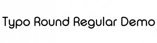
![Typo Round Regular Demo font caratteri gratis]() Scaricare 6415 Downloads@WebFont
Scaricare 6415 Downloads@WebFont -
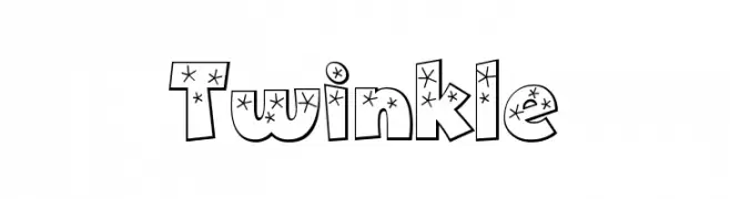
( Fonts by Bright Ideas )
A bold, playful font with star decorations inside each character.
![Twinkle font caratteri gratis]() Scaricare 6415 Downloads@WebFont
Scaricare 6415 Downloads@WebFont -
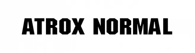
![ATROX normal font caratteri gratis]() Scaricare 6414 Downloads@WebFont
Scaricare 6414 Downloads@WebFont -
( Fonts by PremiereGraphics )
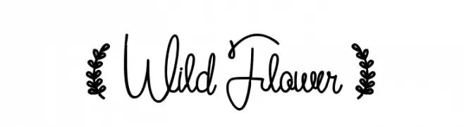
A whimsical, handwritten cursive font with a playful and fluid style.
![( Wild Flower ) font caratteri gratis]() Scaricare 6413 Downloads@WebFont
Scaricare 6413 Downloads@WebFont -
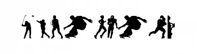
( Fonts by www.4yeo.com )
Silhouette-based display font featuring sports figures.
![4YEOSPORT font caratteri gratis]() Scaricare 6413 Downloads@WebFont
Scaricare 6413 Downloads@WebFont -
![Danley font caratteri gratis]() Scaricare 6412 Downloads@WebFont
Scaricare 6412 Downloads@WebFont -
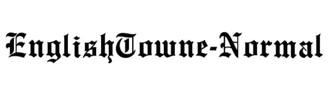
![EnglishTowne-Normal font caratteri gratis]() Scaricare 6411 Downloads
Scaricare 6411 Downloads -
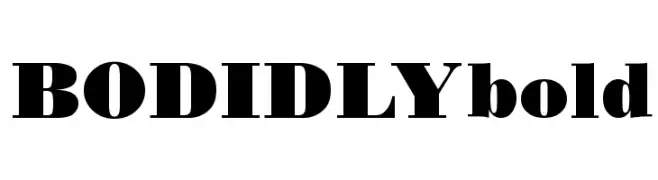
![BODIDLYbold font caratteri gratis]() Scaricare 6411 Downloads
Scaricare 6411 Downloads -
Caratteri di Raine. For commercial use please contact the owner.
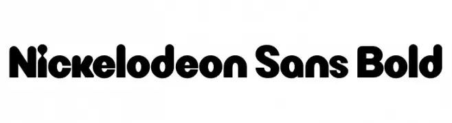
( Nick Sans Font )
A bold, rounded font with a playful and friendly appearance.
![Nickelodeon Sans Bold font caratteri gratis]() Scaricare 6407 Downloads@WebFont
Scaricare 6407 Downloads@WebFont -
![PumpTriD font caratteri gratis]() Scaricare 6404 Downloads@WebFont
Scaricare 6404 Downloads@WebFont -
( گالری فانت فارسی پژوهش آريانا - only compatible with Farsi and Arabic )
A flowing, elegant script font with artistic curves.
![Lotus font caratteri gratis]() Scaricare 6403 Downloads@WebFont
Scaricare 6403 Downloads@WebFont -
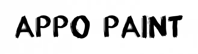
( Fonts by Grafito Design - dibujosenlinea.ideasintegrales.net )
A bold, brushstroke font with an artistic and dynamic style.
![appo paint font caratteri gratis]() Scaricare 6401 Downloads@WebFont
Scaricare 6401 Downloads@WebFont -
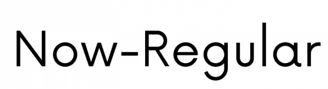
( Fonts by Hanken Design Co. - Personal-use only. For commercial use please contact owner. )
A modern, geometric sans-serif font with balanced proportions and high legibility.
![Now-Regular font caratteri gratis]() Scaricare 6398 Downloads@WebFont
Scaricare 6398 Downloads@WebFont -
( Fonts by www.ajpaglia.com - FREE for personal or commercial usage )
A bold, geometric font with strong, angular characters ideal for impactful designs.
![Alley-Oop font caratteri gratis]() Scaricare 6398 Downloads@WebFont
Scaricare 6398 Downloads@WebFont -
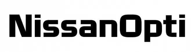
( Fonts by Castcraft Software - opti.netii.net - check the website before use )
A bold, modern font with geometric shapes and clean lines.
![NissanOpti font caratteri gratis]() Scaricare 6397 Downloads@WebFont
Scaricare 6397 Downloads@WebFont -
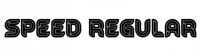
( Fonts by Vladimir Nikolic - https://www.creativefabrica.com/product/educated-deers/ref/144265/ - Personal-use only. For commercial use please contact owner. )
A bold, geometric font with a three-dimensional, retro-futuristic style.
![Speed Regular font caratteri gratis]() Scaricare 6396 Downloads@WebFont
Scaricare 6396 Downloads@WebFont -
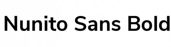
( Copyright 2016 The Nunito Project Authors (contact@sansoxygen.com) )
A modern sans-serif font with rounded terminals and balanced proportions.
![Nunito Sans Bold font caratteri gratis]() Scaricare 6396 Downloads@WebFont
Scaricare 6396 Downloads@WebFont -
![Bleach font caratteri gratis]() Scaricare 6396 Downloads@WebFont
Scaricare 6396 Downloads@WebFont -
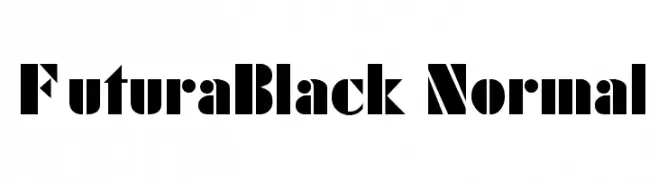
![FuturaBlack Normal font caratteri gratis]() Scaricare 6396 Downloads
Scaricare 6396 Downloads -
( Fonts by Mario Arturo - marioarturo.com. Personal-use only. For commercial use please contact owner. Contact the owner for a donation. )
An elegant script font with flowing, connected letters and a sophisticated style.
![Angelface font caratteri gratis]() Scaricare 6391 Downloads@WebFont
Scaricare 6391 Downloads@WebFont -
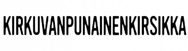
( Fonts by junkohanhero )
A bold, condensed font with a modern and impactful style.
![Kirkuvanpunainen kirsikka font caratteri gratis]() Scaricare 6390 Downloads@WebFont
Scaricare 6390 Downloads@WebFont -
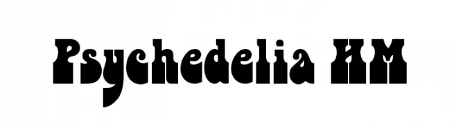
Caratteri di PsychedelicType. For commercial use please contact the owner.
![Psychedelia HM font caratteri gratis]() Scaricare 6389 Downloads@WebFont
Scaricare 6389 Downloads@WebFont -
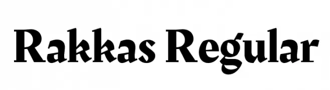
( Copyright 2016 Zeynep Akay )
A bold, dynamic serif font with high contrast and a modern twist.
![Rakkas Regular font caratteri gratis]() Scaricare 6387 Downloads@WebFont
Scaricare 6387 Downloads@WebFont -
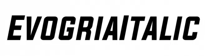
( Fonts by a Situjuh Nazara - c7n1.wordpress.com. Personal-use only. For commercial use please contact owner. )
A bold, italicized font with a modern and dynamic style.
![Evogria Italic font caratteri gratis]() Scaricare 6384 Downloads@WebFont
Scaricare 6384 Downloads@WebFont -
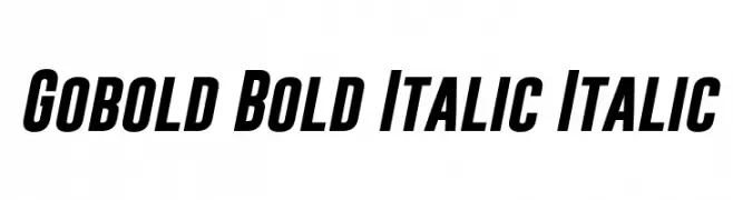
( Fonts by a Situjuh Nazara - c7n1.wordpress.com. Personal-use only. For commercial use please contact owner. )
A bold, italicized font with a dynamic and modern style.
![Gobold Bold Italic Italic font caratteri gratis]() Scaricare 6381 Downloads@WebFont
Scaricare 6381 Downloads@WebFont


Quali sono i font più popolari adesso?
Poppins, Roboto, Montserrat, Open Sans e Lato sono molto usati per le forme pulite e l'ampia applicabilità — dall'identità di marca alle landing page e ai poster.
Quali font si usano spesso nei loghi?
Le sans serif geometriche (es. Poppins, famiglie in stile Gotham) sono scelte comuni per un branding pulito e scalabile. Per un tocco personale restano valide script e stili manoscritti. Abbina un display deciso per i titoli a un corpo testo neutro per riconoscibilità ed equilibrio.
Ogni quanto si aggiorna la lista?
Con regolarità, in base ai download e all'attività reale. Torna spesso per scoprire in anticipo le nuove preferite.
💡 Consiglio: aggiungi ai preferiti — le tendenze cambiano in fretta e i font top di oggi possono ispirare il rebranding di domani.