Benvenuto nelle Font Più Popolari — dove popolarità e qualità si incontrano. Qui trovi i font più scaricati e usati dell'anno. Se cerchi scelte sicure per logo, web o social, inizia da qui.
Ogni font top si distingue per equilibrio, leggibilità e versatilità. Troverai sans serif moderne, script eleganti, serif vintage e display minimalisti.
-
 Scaricare 3534 Downloads@WebFont
 -
( Fonts by Flavia Bocco )
A bold, robust font with thick strokes and slight curvature, ideal for headlines.
![Vintage font caratteri gratis]() Scaricare 3534 Downloads@WebFont
Scaricare 3534 Downloads@WebFont -
![Dali font caratteri gratis]() Scaricare 3534 Downloads@WebFont
Scaricare 3534 Downloads@WebFont -
( Fonts by HENRIavecunK. Personal-use only. For commercial use please contact owner. )
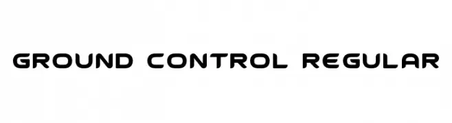
A futuristic, geometric font with rounded edges and consistent weight.
![Ground Control Regular font caratteri gratis]() Scaricare 3533 Downloads@WebFont
Scaricare 3533 Downloads@WebFont -
( Fonts by Harold Lohner - www.haroldsfonts.com )
A bold, geometric font with strong strokes and sharp angles.
![Alhambra Deep font caratteri gratis]() Scaricare 3533 Downloads@WebFont
Scaricare 3533 Downloads@WebFont -
-
![What time is it? font caratteri gratis]() Scaricare 3533 Downloads@WebFont
Scaricare 3533 Downloads@WebFont -
( Fonts by Agathe M.Joyce - www.foundmyfont.com - Personal-use only. For commercial use please contact owner. )
A lively, elegant script font with flowing, interconnected letters.
![Enchanting Celebrations font caratteri gratis]() Scaricare 3532 Downloads@WebFont
Scaricare 3532 Downloads@WebFont -
![Ajay Normal font caratteri gratis]() Scaricare 3532 Downloads
Scaricare 3532 Downloads -
( Fonts by Ryoichi Tsunekawa - www.dharmatype.com )
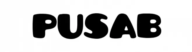
A bold, playful font with rounded, bubble-like characters.
![Pusab font caratteri gratis]() Scaricare 3532 Downloads@WebFont
Scaricare 3532 Downloads@WebFont -
![--atari-kids-- font caratteri gratis]() Scaricare 3532 Downloads@WebFont
Scaricare 3532 Downloads@WebFont -
( Fonts by Tursun Sultan - Personal-use only. For commercial use please contact owner. )
A traditional blackletter font with ornate, angular letterforms and high contrast.
![UKIJ Kufi Tar font caratteri gratis]() Scaricare 3531 Downloads@WebFont
Scaricare 3531 Downloads@WebFont -
( Copyright (c) 2012 Andhrapradesh Society for Knowledge Networks (fonts.siliconandhra.org). )
A classic serif font with elegant strokes and refined design.
![Suranna font caratteri gratis]() Scaricare 3531 Downloads@WebFont
Scaricare 3531 Downloads@WebFont -
![Oak Wood font caratteri gratis]() Scaricare 3530 Downloads@WebFont
Scaricare 3530 Downloads@WebFont -
( Fonts by Arkandis Digital Foundry )
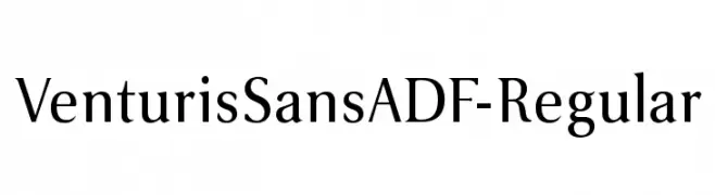
A classic serif font with elegant strokes and excellent readability.
![VenturisSansADF-Regular font caratteri gratis]() Scaricare 3529 Downloads@WebFont
Scaricare 3529 Downloads@WebFont -
( Fonts by www.varian.net )
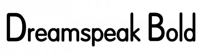
A bold, rounded sans-serif font with a modern and friendly appearance.
![Dreamspeak Bold font caratteri gratis]() Scaricare 3528 Downloads@WebFont
Scaricare 3528 Downloads@WebFont -
( www.fontfabulous.weebly.com )
A playful, handwritten font with an informal and whimsical style.
![MaryKate font caratteri gratis]() Scaricare 3527 Downloads@WebFont
Scaricare 3527 Downloads@WebFont -
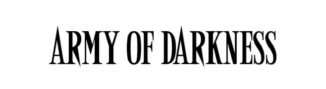
![Army of Darkness font caratteri gratis]() Scaricare 3527 Downloads@WebFont
Scaricare 3527 Downloads@WebFont -
![Udgam font caratteri gratis]() Scaricare 3526 Downloads@WebFont
Scaricare 3526 Downloads@WebFont -
![Cyclo Trial font caratteri gratis]() Scaricare 3526 Downloads@WebFont
Scaricare 3526 Downloads@WebFont -
( Fonts by Rodrigo German - RASDESIGN )
The image features hand-drawn illustrations, not a standard font.
![chile font caratteri gratis]() Scaricare 3526 Downloads@WebFont
Scaricare 3526 Downloads@WebFont -
Caratteri di amy9. For commercial use please contact the owner.
![Twiggy font caratteri gratis]() Scaricare 3525 Downloads@WebFont
Scaricare 3525 Downloads@WebFont -
![M+ 1p thin font caratteri gratis]() Scaricare 3525 Downloads@WebFont
Scaricare 3525 Downloads@WebFont -
![Excalibur Monospace font caratteri gratis]() Scaricare 3525 Downloads
Scaricare 3525 Downloads -
( Craft Supply Co. - creativemarket.com/craftsupplyco )
A bold, brush-style font with dynamic, hand-drawn characteristics.
![BaforaDemo font caratteri gratis]() Scaricare 3524 Downloads@WebFont
Scaricare 3524 Downloads@WebFont -
( Fonts by a Galdino Otten - galdinootten.com . Personal-use only. For commercial use please contact owner. )
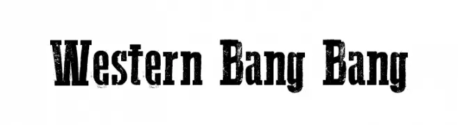
A bold, distressed font with a vintage Western style.
![Western Bang Bang font caratteri gratis]() Scaricare 3524 Downloads@WebFont
Scaricare 3524 Downloads@WebFont -
( Fonts by Manfred Klein - manfred-klein.ina-mar.com )
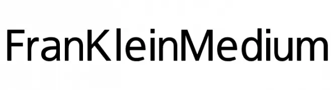
A modern, sans-serif font with clean lines and balanced spacing.
![FranKleinMedium font caratteri gratis]() Scaricare 3521 Downloads@WebFont
Scaricare 3521 Downloads@WebFont -
Caratteri di Kemal. For commercial use please contact the owner.
![ModifiedbyKEMAL font caratteri gratis]() Scaricare 3520 Downloads@WebFont
Scaricare 3520 Downloads@WebFont -
![NHL Edge Minnesota Home font caratteri gratis]() Scaricare 3520 Downloads@WebFont
Scaricare 3520 Downloads@WebFont -
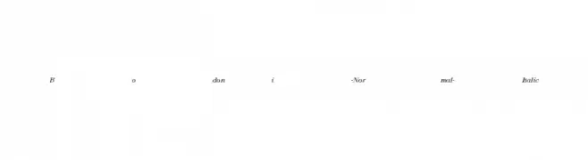
![Bodoni-Normal-Italic font caratteri gratis]() Scaricare 3519 Downloads
Scaricare 3519 Downloads -
( Fonts by Apostrophic Lab )
A bold, playful font with rounded edges and a bubbly appearance.
![Distro Bold font caratteri gratis]() Scaricare 3519 Downloads@WebFont
Scaricare 3519 Downloads@WebFont -
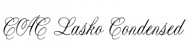
![CAC Lasko Condensed font caratteri gratis]() Scaricare 3518 Downloads@WebFont
Scaricare 3518 Downloads@WebFont -
( Typia Nesia - www.myfonts.com/foundry/Typia_Nesia/ )
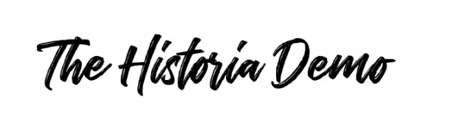
A bold, expressive script font with a hand-drawn, dynamic style.
![The Historia Demo font caratteri gratis]() Scaricare 3517 Downloads@WebFont
Scaricare 3517 Downloads@WebFont -
![101! Chinese Zodiac font caratteri gratis]() Scaricare 3517 Downloads@WebFont
Scaricare 3517 Downloads@WebFont -
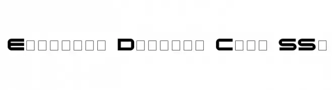
![Eyechart Display Caps SSi font caratteri gratis]() Scaricare 3517 Downloads
Scaricare 3517 Downloads -
( Fonts by Manfred Klein - manfred-klein.ina-mar.com )
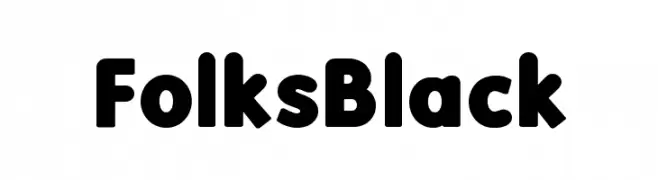
A bold, rounded font with a friendly and approachable style.
![FolksBlack font caratteri gratis]() Scaricare 3517 Downloads@WebFont
Scaricare 3517 Downloads@WebFont


Quali sono i font più popolari adesso?
Poppins, Roboto, Montserrat, Open Sans e Lato sono molto usati per le forme pulite e l'ampia applicabilità — dall'identità di marca alle landing page e ai poster.
Quali font si usano spesso nei loghi?
Le sans serif geometriche (es. Poppins, famiglie in stile Gotham) sono scelte comuni per un branding pulito e scalabile. Per un tocco personale restano valide script e stili manoscritti. Abbina un display deciso per i titoli a un corpo testo neutro per riconoscibilità ed equilibrio.
Ogni quanto si aggiorna la lista?
Con regolarità, in base ai download e all'attività reale. Torna spesso per scoprire in anticipo le nuove preferite.
💡 Consiglio: aggiungi ai preferiti — le tendenze cambiano in fretta e i font top di oggi possono ispirare il rebranding di domani.