Benvenuto nelle Font Più Popolari — dove popolarità e qualità si incontrano. Qui trovi i font più scaricati e usati dell'anno. Se cerchi scelte sicure per logo, web o social, inizia da qui.
Ogni font top si distingue per equilibrio, leggibilità e versatilità. Troverai sans serif moderne, script eleganti, serif vintage e display minimalisti.
-
( Fonts by Wojciech Kalinowski )
A modern, monospaced font with an oblique slant and consistent stroke weight.
 Scaricare 1139 Downloads@WebFont
 -
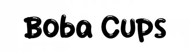
( Fonts by Khurasan )
A playful, rounded font with a bubbly, hand-drawn style.
![Boba Cups font caratteri gratis]() Scaricare 1139 Downloads@WebFont
Scaricare 1139 Downloads@WebFont -
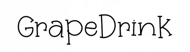
( Fonts by Khurasan )
A playful, hand-drawn font with a whimsical and friendly style.
![Grape Drink font caratteri gratis]() Scaricare 1139 Downloads@WebFont
Scaricare 1139 Downloads@WebFont -
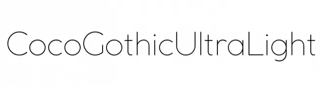
( Zetafonts - www.zetafonts.com )
A sleek, ultra-light font with a modern, minimalist design.
![Coco Gothic UltraLight font caratteri gratis]() Scaricare 1139 Downloads@WebFont
Scaricare 1139 Downloads@WebFont -
( Copyright (c) 2016 Ek Type (www.ektype.in) )
A modern, clean sans-serif font with balanced spacing and consistent stroke width.
![Gotu font caratteri gratis]() Scaricare 1139 Downloads@WebFont
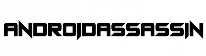
Scaricare 1139 Downloads@WebFont -
![Android Assassin font caratteri gratis]() Scaricare 1139 Downloads@WebFont
Scaricare 1139 Downloads@WebFont -
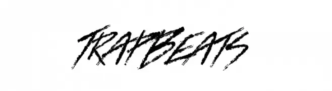
![Trap Beats font caratteri gratis]() Scaricare 1139 Downloads@WebFont
Scaricare 1139 Downloads@WebFont -
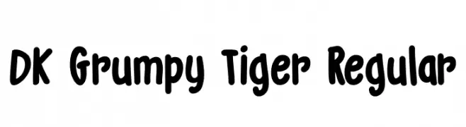
![DK Grumpy Tiger Regular font caratteri gratis]() Scaricare 1139 Downloads@WebFont
Scaricare 1139 Downloads@WebFont -
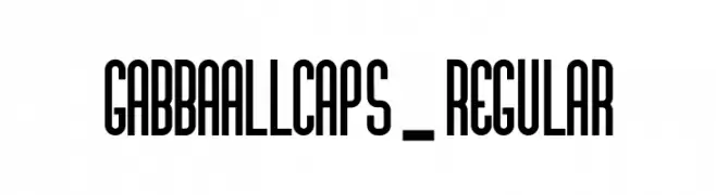
![GabbaAllCaps-Regular font caratteri gratis]() Scaricare 1139 Downloads@WebFont
Scaricare 1139 Downloads@WebFont -
( Fonts by www.blambot.com )
A bold, distressed font with a rugged, vintage feel and narrow characters.
![CryptCreepBB font caratteri gratis]() Scaricare 1139 Downloads@WebFont
Scaricare 1139 Downloads@WebFont -
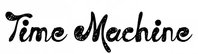
( Fonts by Jonathan Harris - www.tattoowoo.com )
A playful, hand-drawn font with a textured, whimsical style.
![Time Machine font caratteri gratis]() Scaricare 1139 Downloads@WebFont
Scaricare 1139 Downloads@WebFont -
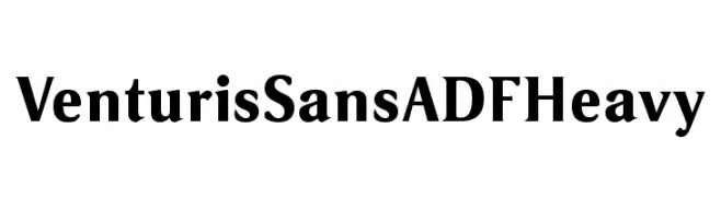
( Fonts by Arkandis Digital Foundry )
A bold, heavy serif font with a classic and authoritative style.
![VenturisSansADFHeavy font caratteri gratis]() Scaricare 1139 Downloads@WebFont
Scaricare 1139 Downloads@WebFont -
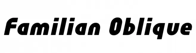
( Fonts by Hideki Katayama - com4t-fff.seesaa.net )
A bold, oblique font with rounded characters and a modern, dynamic style.
![Familian Oblique font caratteri gratis]() Scaricare 1139 Downloads@WebFont
Scaricare 1139 Downloads@WebFont -
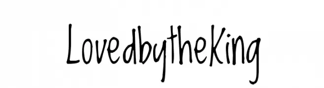
( Copyright (c) 2010, Kimberly Geswein (kimberlygeswein.com) )
A playful, handwritten font with a casual and friendly style.
![LovedbytheKing font caratteri gratis]() Scaricare 1139 Downloads@WebFont
Scaricare 1139 Downloads@WebFont -
![Airboy font caratteri gratis]() Scaricare 1139 Downloads@WebFont
Scaricare 1139 Downloads@WebFont -
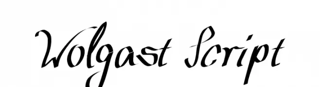
( Fonts by www.peter-wiegel.de. Personal-use only. For commercial use please contact owner. )
An elegant script font with flowing, handwritten-style strokes.
![Wolgast Script font caratteri gratis]() Scaricare 1139 Downloads@WebFont
Scaricare 1139 Downloads@WebFont -
![Crusades font caratteri gratis]() Scaricare 1139 Downloads@WebFont
Scaricare 1139 Downloads@WebFont -
![Gurbani-Lipi Bold font caratteri gratis]() Scaricare 1139 Downloads@WebFont
Scaricare 1139 Downloads@WebFont -
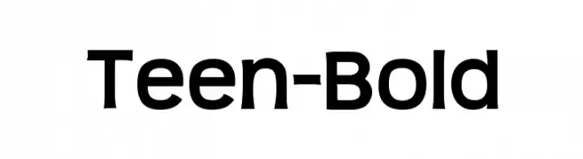
( Fonts by www.typodermicfonts.com - Ray Larabie )
A bold, modern sans-serif font with clean lines and strong presence.
![Teen-Bold font caratteri gratis]() Scaricare 1139 Downloads@WebFont
Scaricare 1139 Downloads@WebFont -
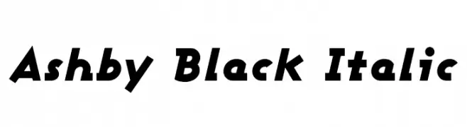
( Fonts by Apostrophic Lab )
A bold, italic font with a dynamic and energetic style.
![Ashby Black Italic font caratteri gratis]() Scaricare 1139 Downloads@WebFont
Scaricare 1139 Downloads@WebFont -
( Fonts by Apostrophic Lab )
A modern, elegant font with clean lines and geometric structure.
![Usenet font caratteri gratis]() Scaricare 1139 Downloads@WebFont
Scaricare 1139 Downloads@WebFont -
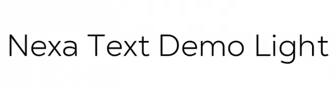
( Fonts by Fontfabric - Svetoslav Simov - Personal-use only. For commercial use please contact owner. )
A modern, geometric sans-serif font with a clean and professional look.
![Nexa Text Demo Light font caratteri gratis]() Scaricare 1138 Downloads@WebFont
Scaricare 1138 Downloads@WebFont -
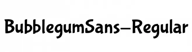
( Fonts by Sudtipos )
A playful, bubbly font with smooth, rounded characters.
![BubblegumSans-Regular font caratteri gratis]() Scaricare 1138 Downloads@WebFont
Scaricare 1138 Downloads@WebFont -
( Fonts by Vladimir Nikolic - https://www.creativefabrica.com/product/educated-deers/ref/144265/ - Personal-use only. For commercial use please contact owner. )
A bold, geometric font with strong lines and a modern style.
![Educated Deers Regular font caratteri gratis]() Scaricare 1138 Downloads@WebFont
Scaricare 1138 Downloads@WebFont -
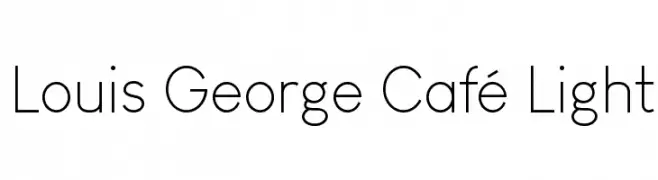
( Chen Yining )
A clean, modern sans-serif font with a light weight and minimalistic design.
![Louis George Café Light font caratteri gratis]() Scaricare 1138 Downloads@WebFont
Scaricare 1138 Downloads@WebFont -
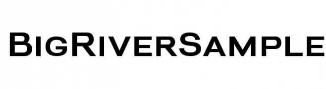
( Ana - www.anasfonts.com/ )
A modern sans-serif font with clean lines and a slightly condensed width.
![BigRiverSample font caratteri gratis]() Scaricare 1138 Downloads@WebFont
Scaricare 1138 Downloads@WebFont -
![Igbo Regular font caratteri gratis]() Scaricare 1138 Downloads@WebFont
Scaricare 1138 Downloads@WebFont -
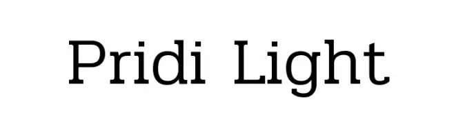
( Copyright (c) 2015, Cadson Demak (info@cadsondemak.com) )
A modern, clean typeface with subtle stroke contrast and excellent readability.
![Pridi Light font caratteri gratis]() Scaricare 1138 Downloads@WebFont
Scaricare 1138 Downloads@WebFont -
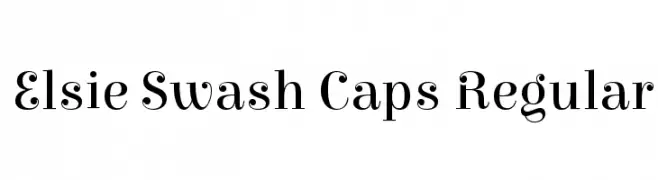
( Copyright (c) 2010-2012, Alejandro Inler (alejandroinler@gmail.com), with Reserved Font Name 'Elsie' )
An elegant, decorative serif font with ornate swash elements.
![Elsie Swash Caps Regular font caratteri gratis]() Scaricare 1138 Downloads@WebFont
Scaricare 1138 Downloads@WebFont -
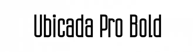
Caratteri di defharo. For commercial use please contact the owner.
![Ubicada Pro Bold font caratteri gratis]() Scaricare 1138 Downloads@WebFont
Scaricare 1138 Downloads@WebFont -
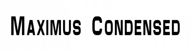
![Maximus Condensed font caratteri gratis]() Scaricare 1138 Downloads@WebFont
Scaricare 1138 Downloads@WebFont -
Caratteri di Qbotype. For commercial use please contact the owner.
( Fonts by www.phuxerdesigns.com.ar - Non-commercial use of any typeface free version, only buying the full version )
A modern, geometric font with rounded edges and a bold, cohesive appearance.
![Zian font caratteri gratis]() Scaricare 1138 Downloads@WebFont
Scaricare 1138 Downloads@WebFont -
![Boink font caratteri gratis]() Scaricare 1138 Downloads@WebFont
Scaricare 1138 Downloads@WebFont -
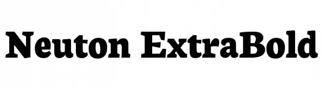
( Copyright 2010 The Neuton Project Authors (http://www.21326.info/), with Reserved Font Name "Neuton". )
A bold serif font with strong strokes and prominent serifs.
![Neuton ExtraBold font caratteri gratis]() Scaricare 1138 Downloads@WebFont
Scaricare 1138 Downloads@WebFont -
![Hairy Monster Solid font caratteri gratis]() Scaricare 1138 Downloads@WebFont
Scaricare 1138 Downloads@WebFont


Quali sono i font più popolari adesso?
Poppins, Roboto, Montserrat, Open Sans e Lato sono molto usati per le forme pulite e l'ampia applicabilità — dall'identità di marca alle landing page e ai poster.
Quali font si usano spesso nei loghi?
Le sans serif geometriche (es. Poppins, famiglie in stile Gotham) sono scelte comuni per un branding pulito e scalabile. Per un tocco personale restano valide script e stili manoscritti. Abbina un display deciso per i titoli a un corpo testo neutro per riconoscibilità ed equilibrio.
Ogni quanto si aggiorna la lista?
Con regolarità, in base ai download e all'attività reale. Torna spesso per scoprire in anticipo le nuove preferite.
💡 Consiglio: aggiungi ai preferiti — le tendenze cambiano in fretta e i font top di oggi possono ispirare il rebranding di domani.